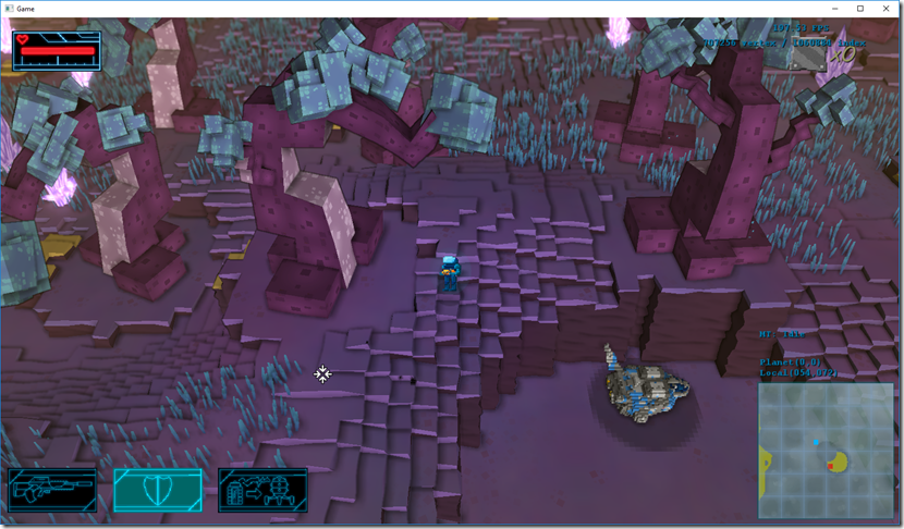
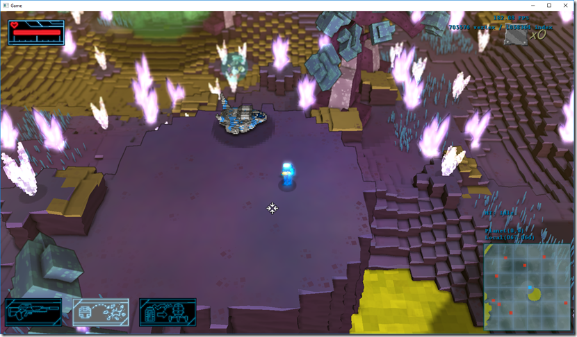
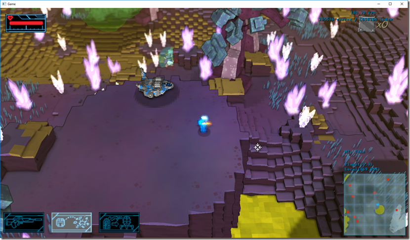
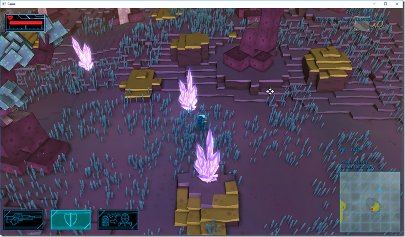
Next week I’ll be at Gamescom, showing Strikers and shopping around for a publisher for Gateway…
In the last few weeks there’s hasn’t been much work on Gateway, except PR related stuff, since we’ve been very busy with other work.
Anyway, I’ve roped some more of the Fun Punch gang to help me with some elements on Gateway.
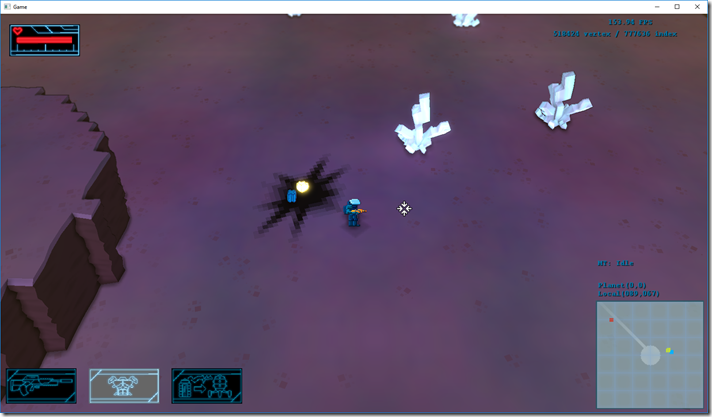
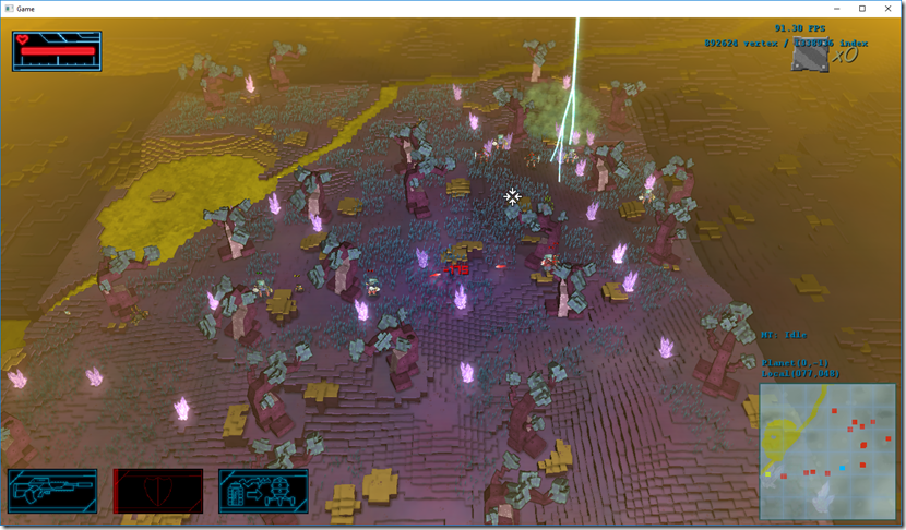
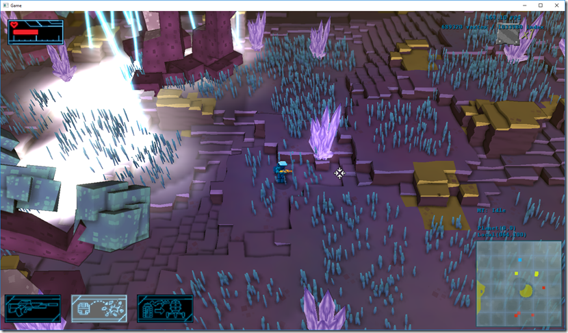
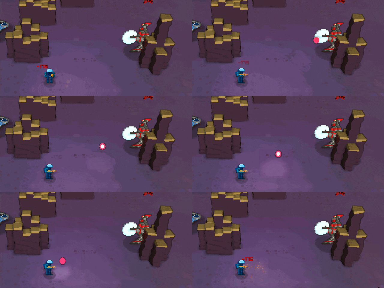
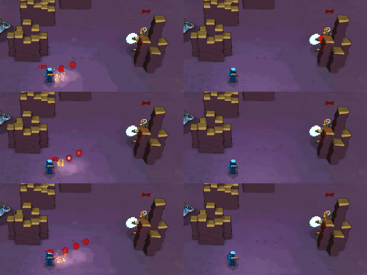
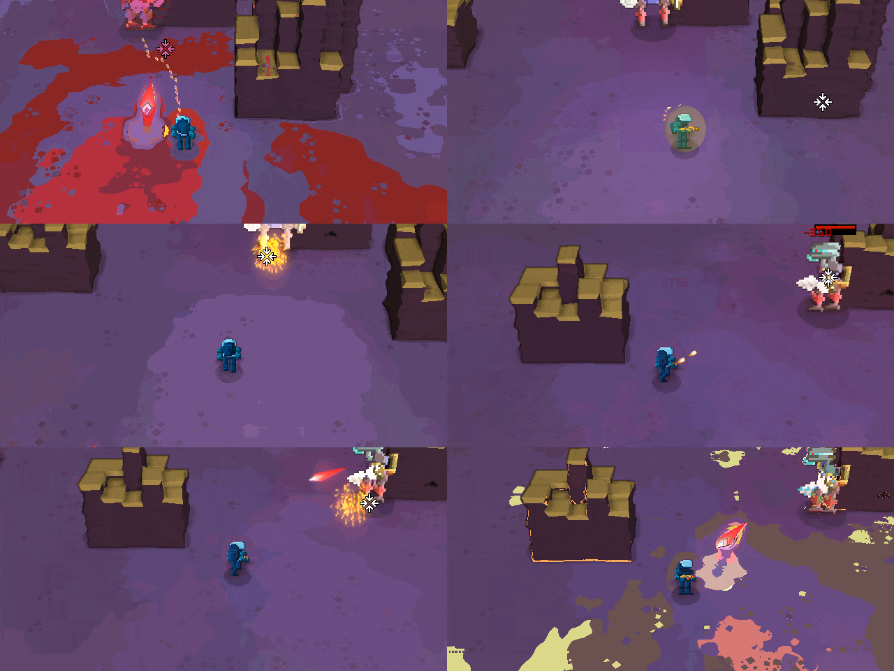
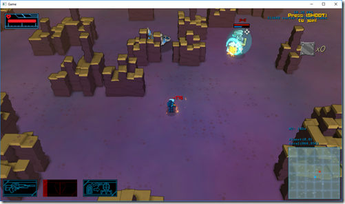
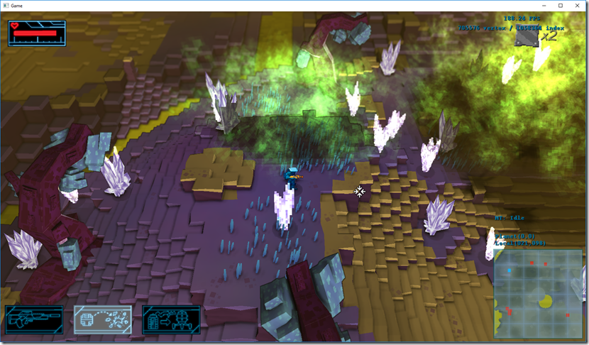
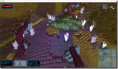
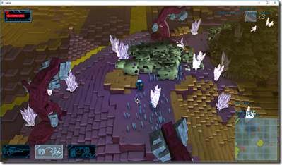
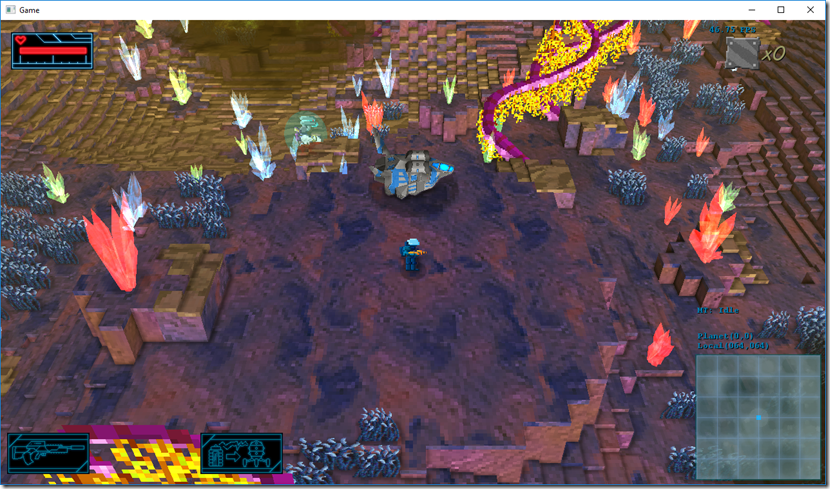
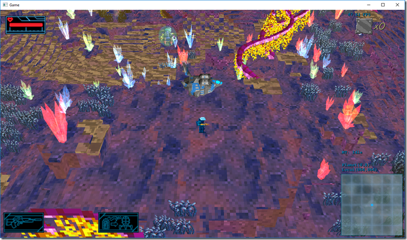
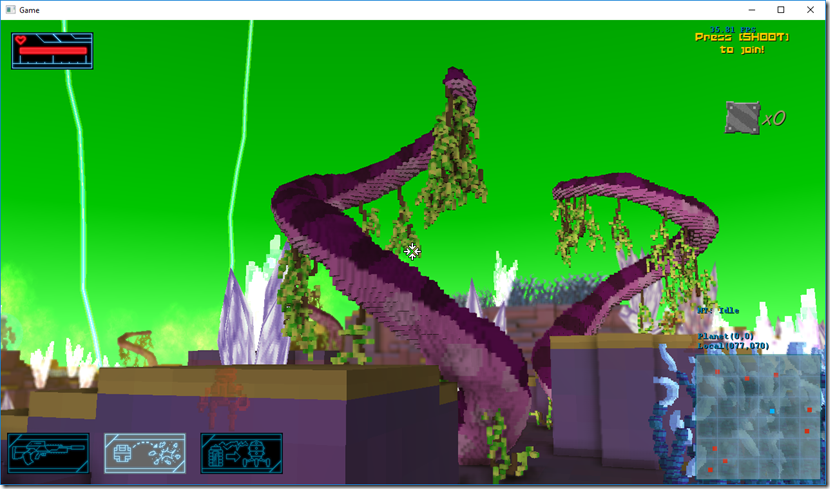
I’ve started replacing some sprites on the game with actual 3d models:

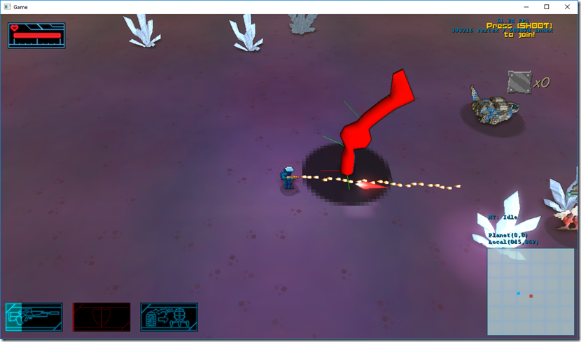
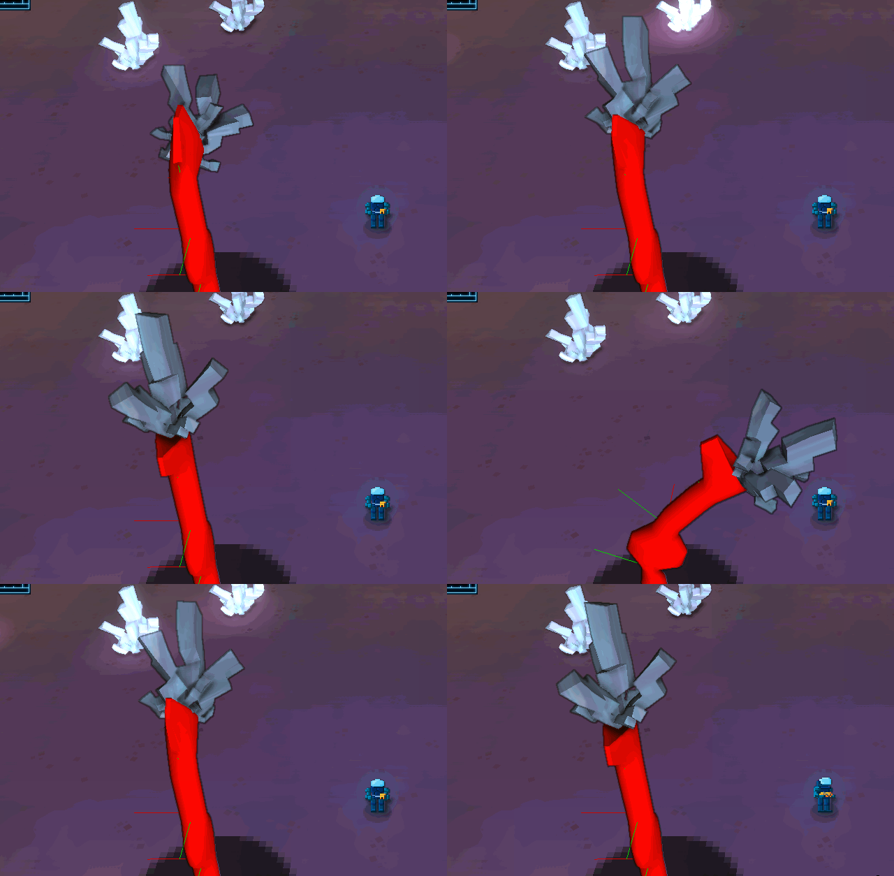
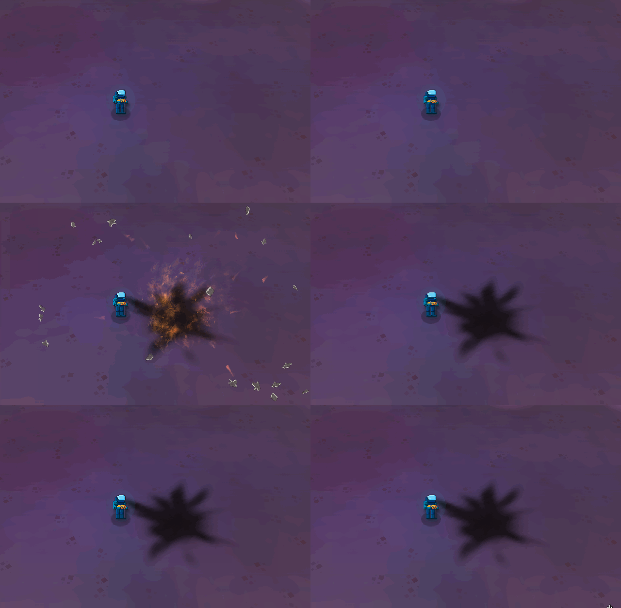
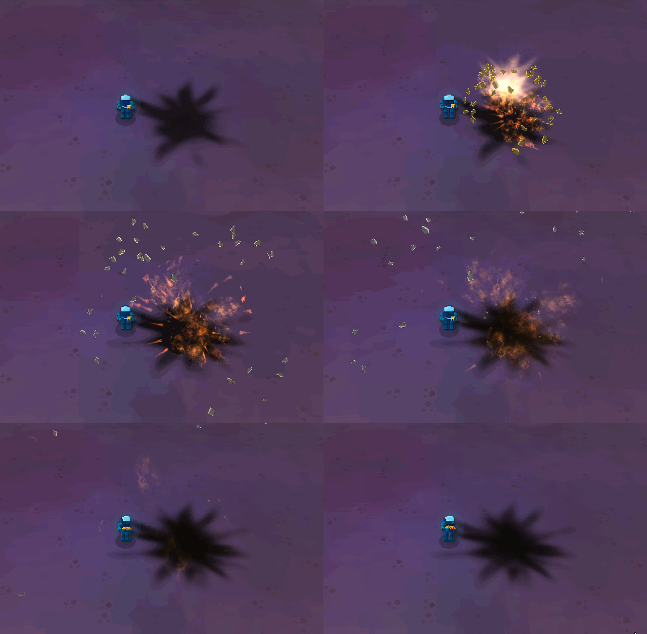
Here we can see the scorpion model (which is pointing the right way, I’ll work on that before showing it) and the new shield effect for 3d models.
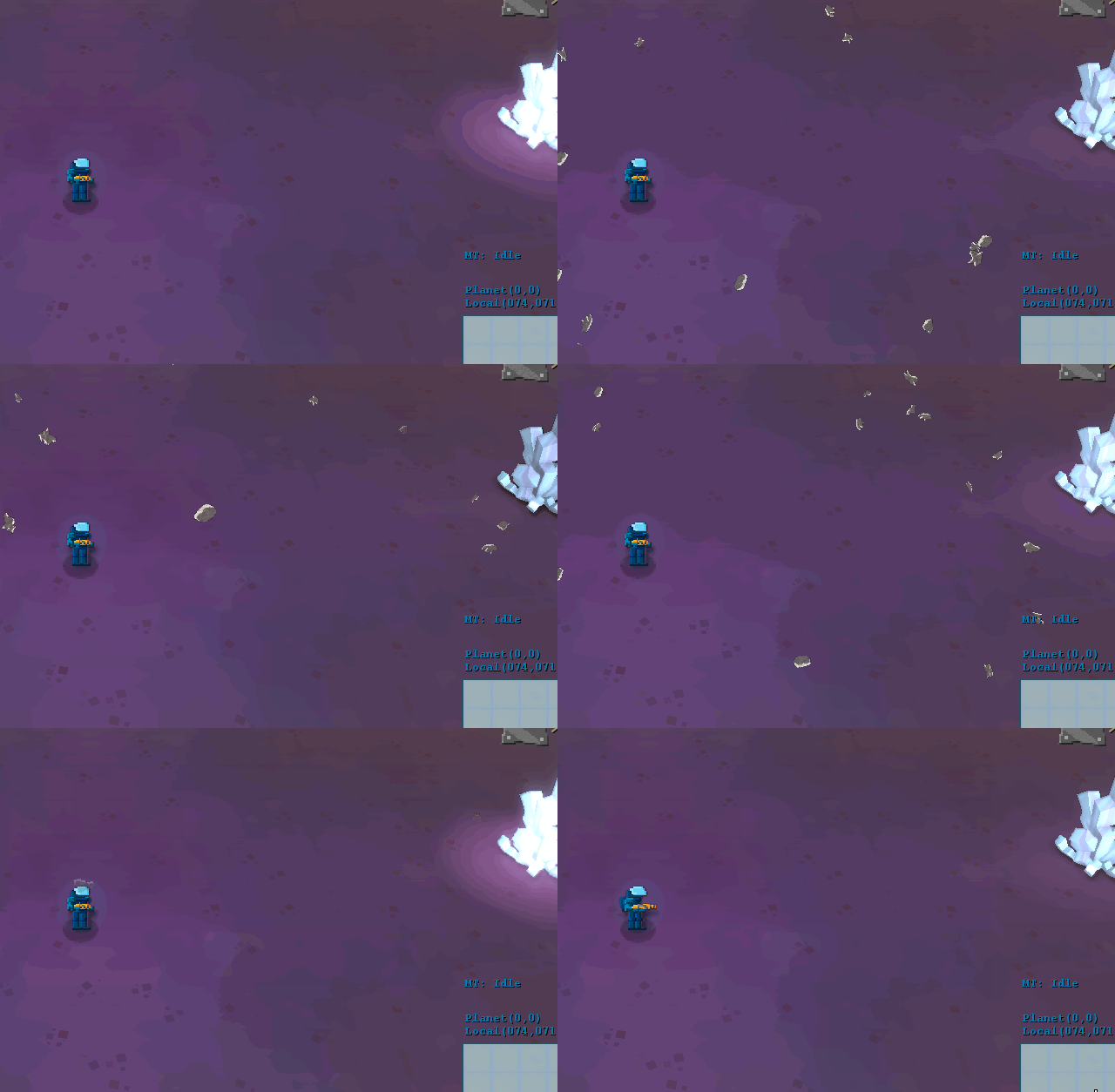
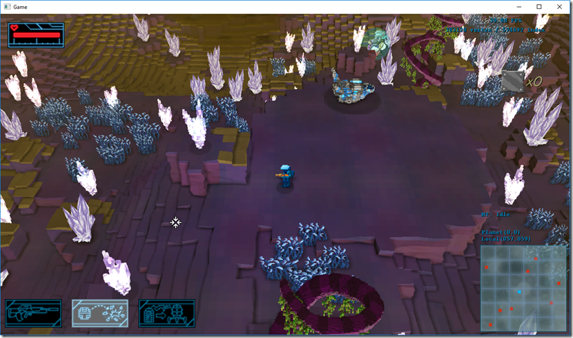
Also replaced the cubes that act as loot with actual models (hard to see in the screenshot below), which kind of makes it a bit more interesting.

Also roped Fun Punch’s concept artist into making some stuff to show off some ideas, but nothing I’d like to share at the moment… 
Hopefully, the new visuals we’ll help Gateway to find someone willing to finance the development!
So the last week and a half, we’ve been working on the player character (still top-secret, shhhhh!), and on new weapon effects.

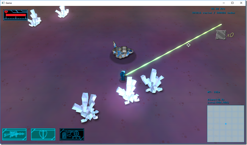
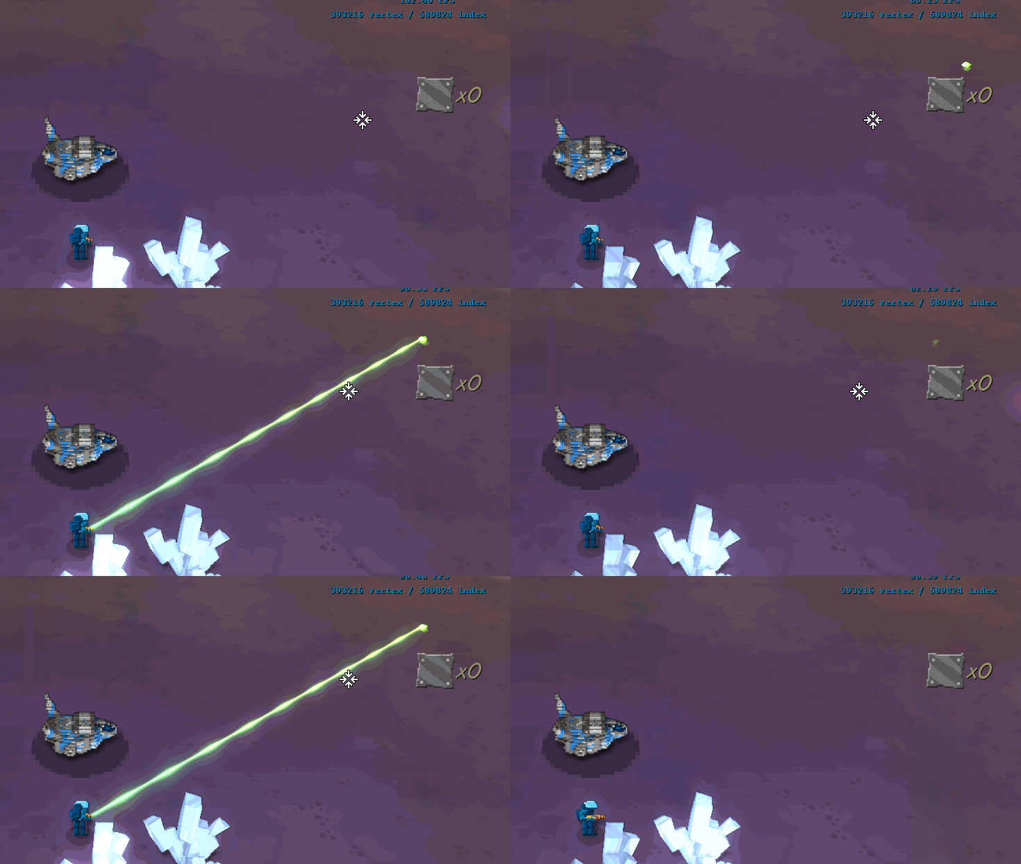
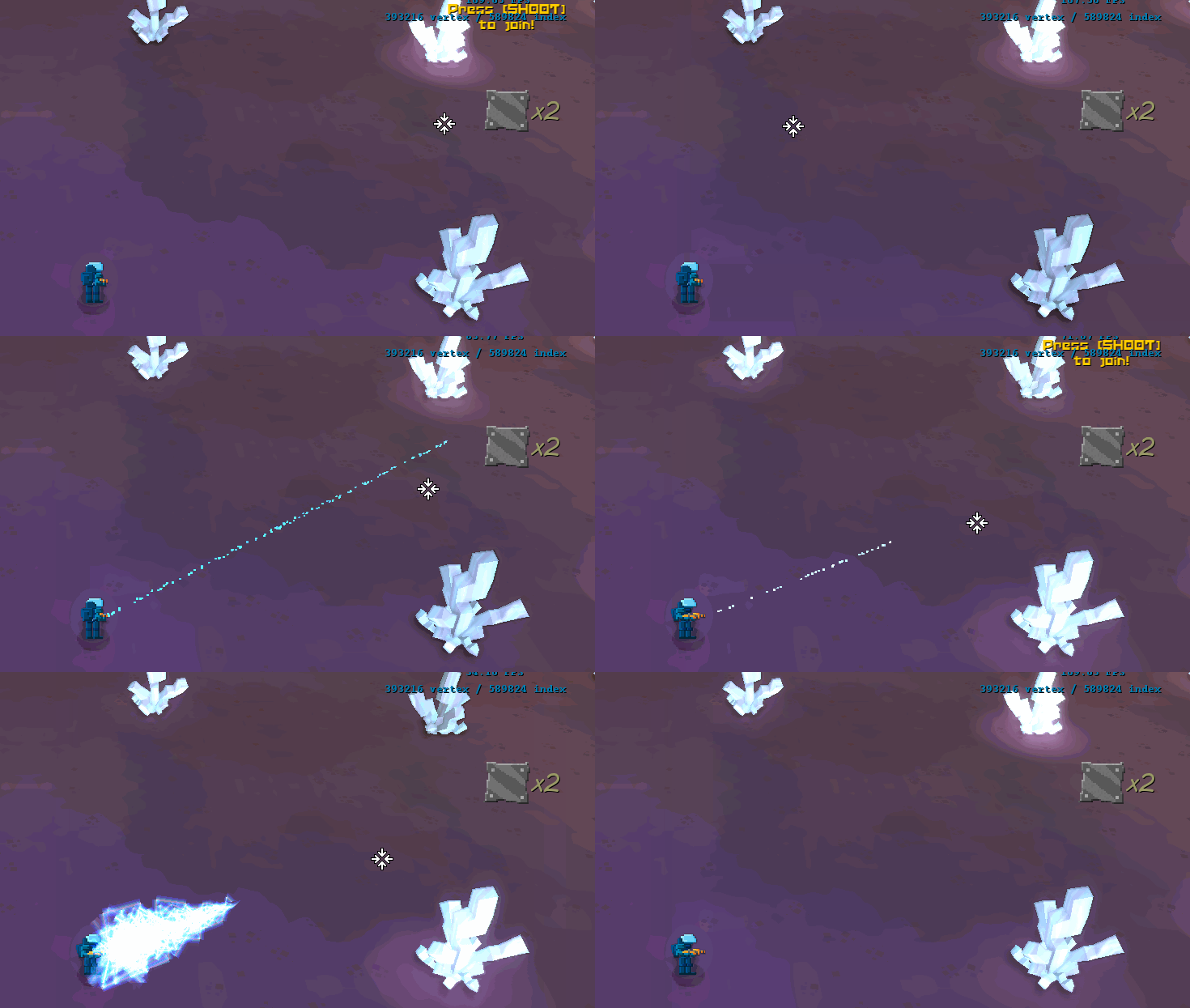
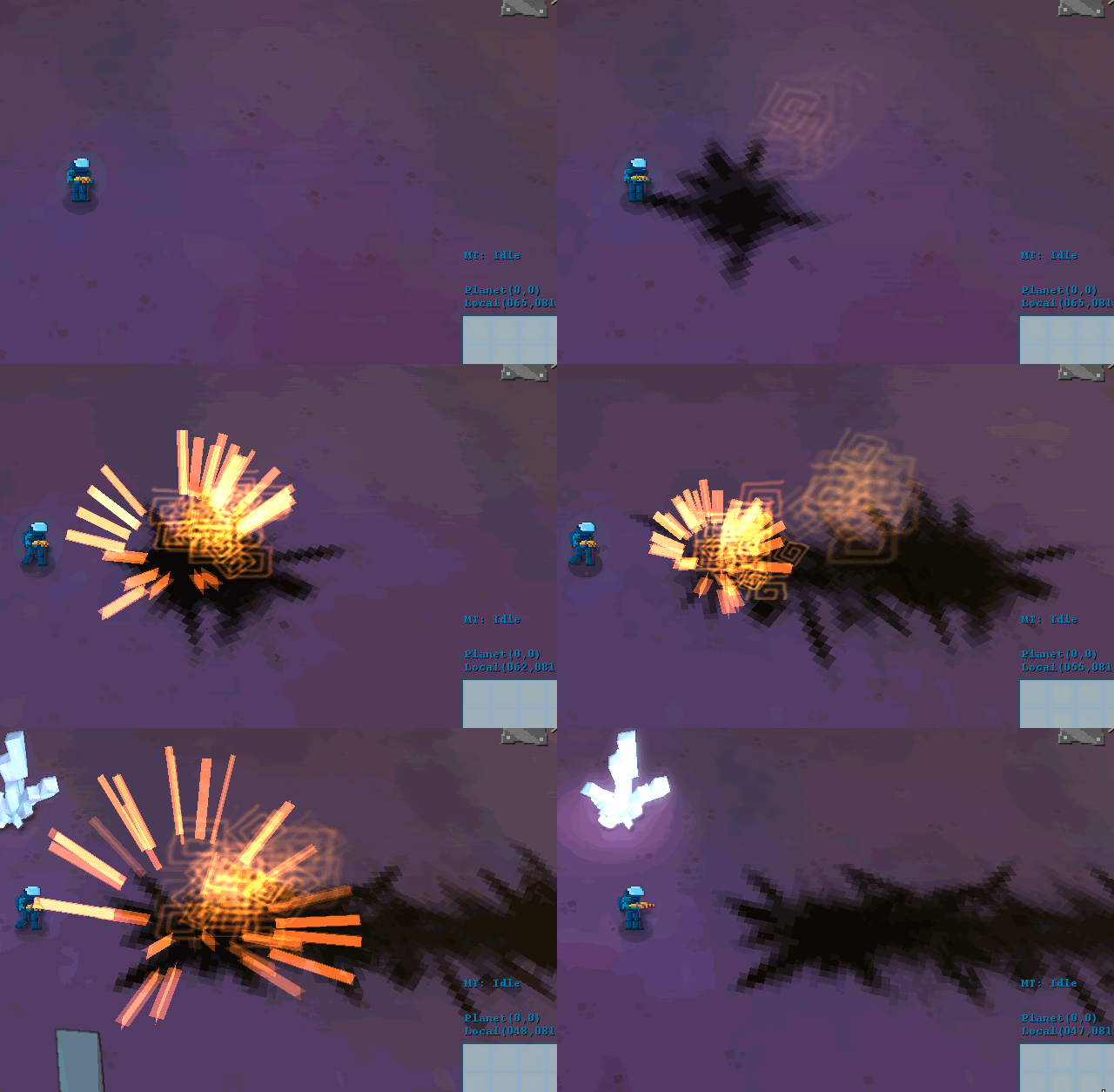
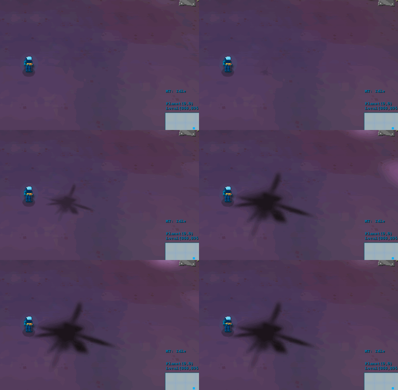
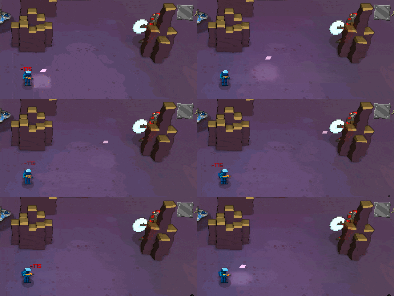
So, here’s the new beam cannon:

Besides adding some glow to it, we added a “burst” when it starts, which improves the “punch” of the weapon. This weapon both heals allies and damages enemies, which explains the fact it doesn’t look that aggressive.
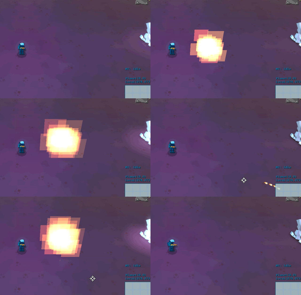
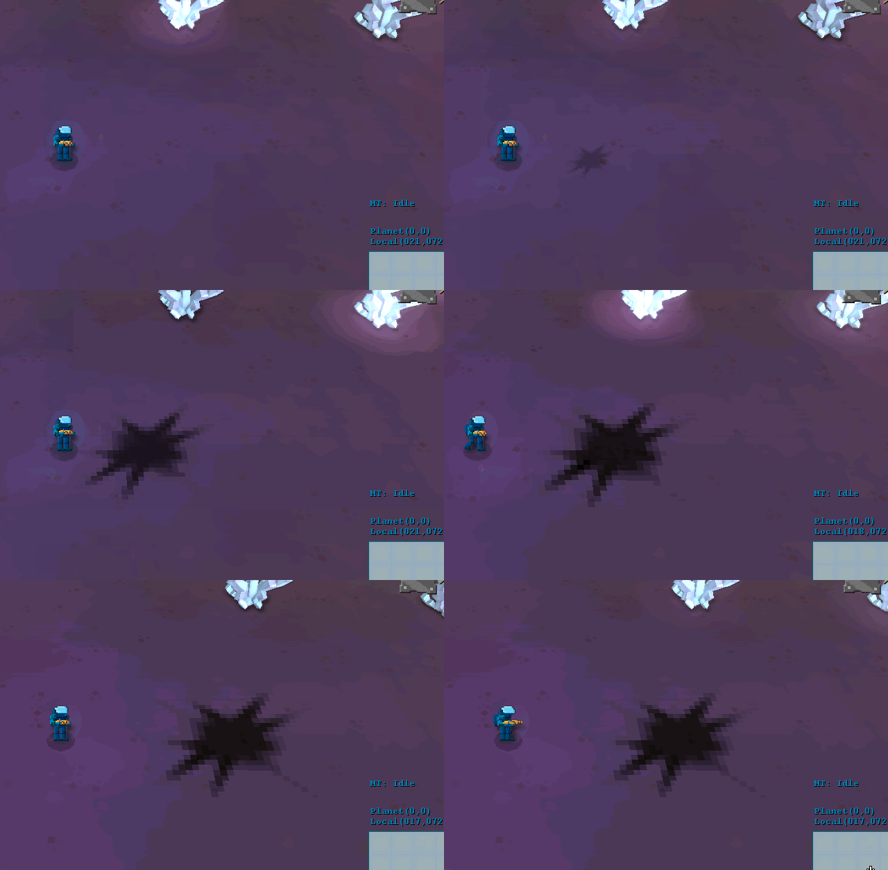
Next up, some work on the electro-cannon:

This one was almost completely remade… It also has that “punch thing”, and at the end you can see it in ultra-slow-motion (10% speed), which looks very weird… 
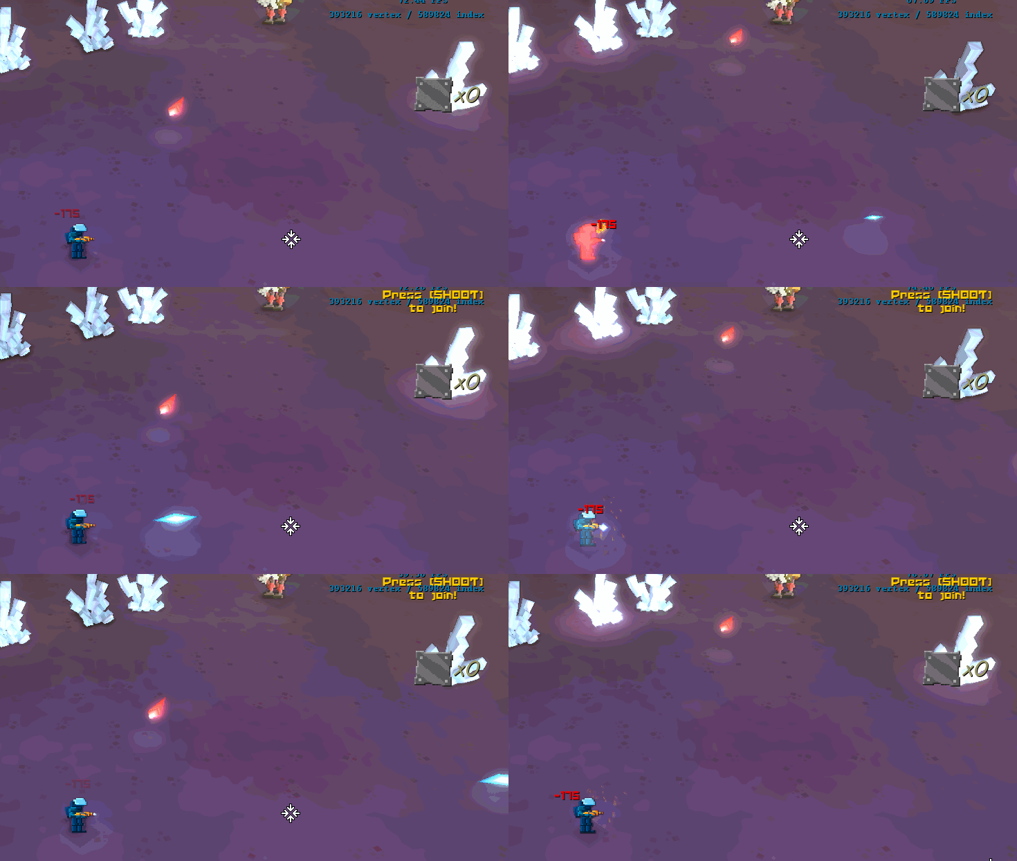
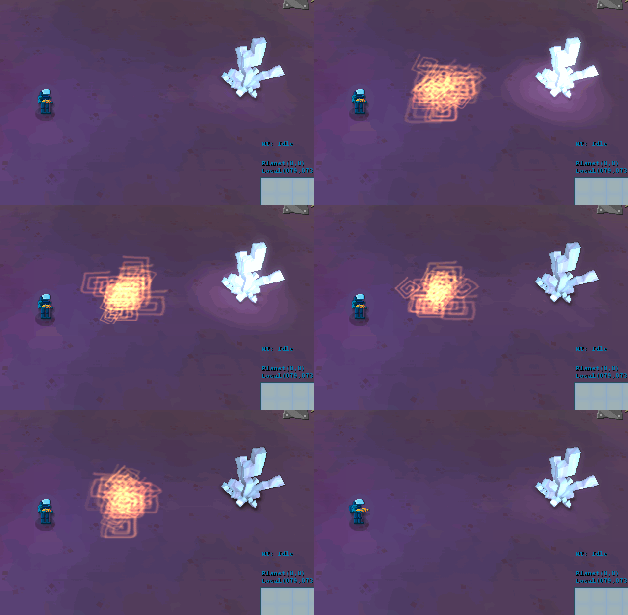
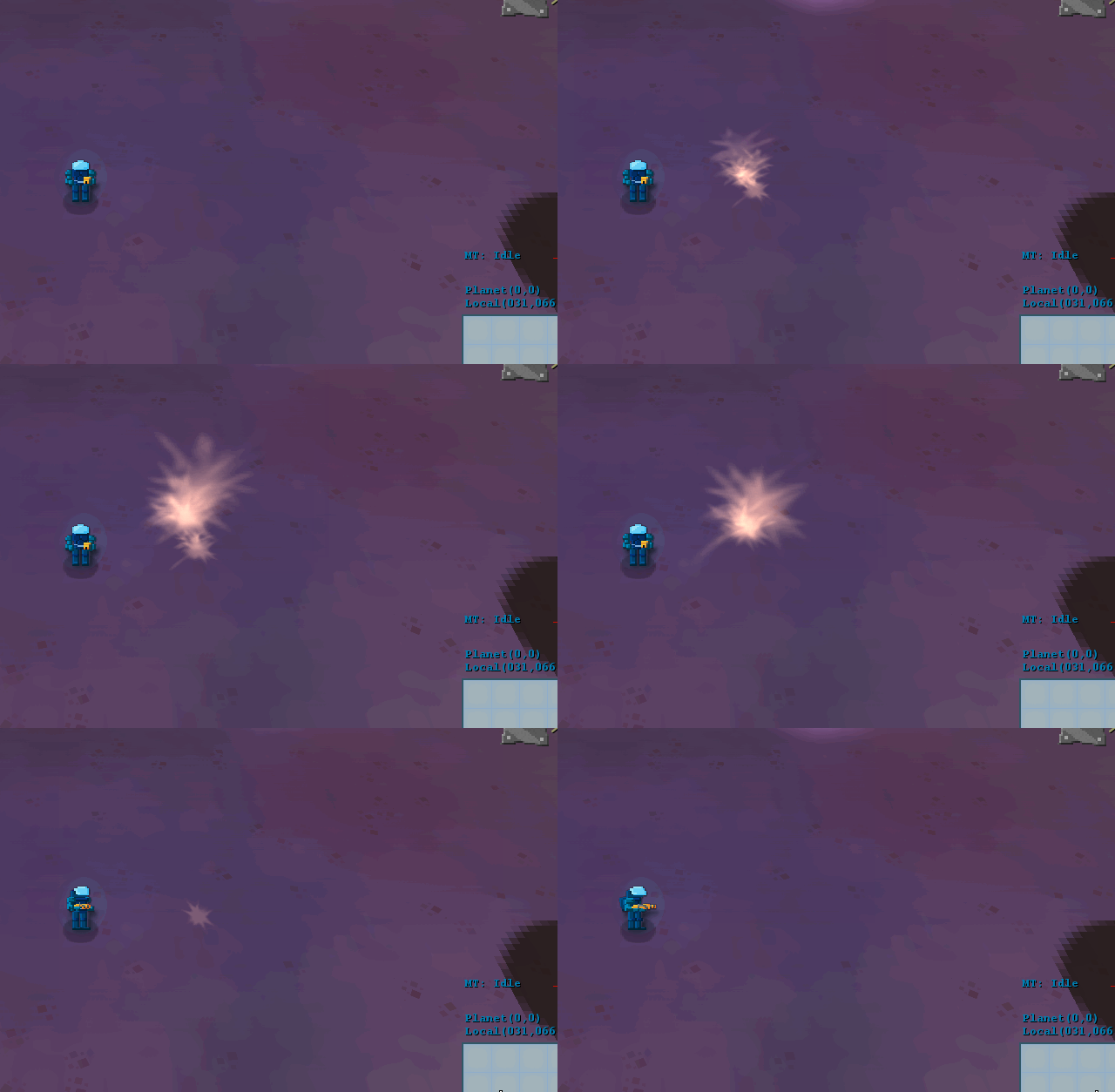
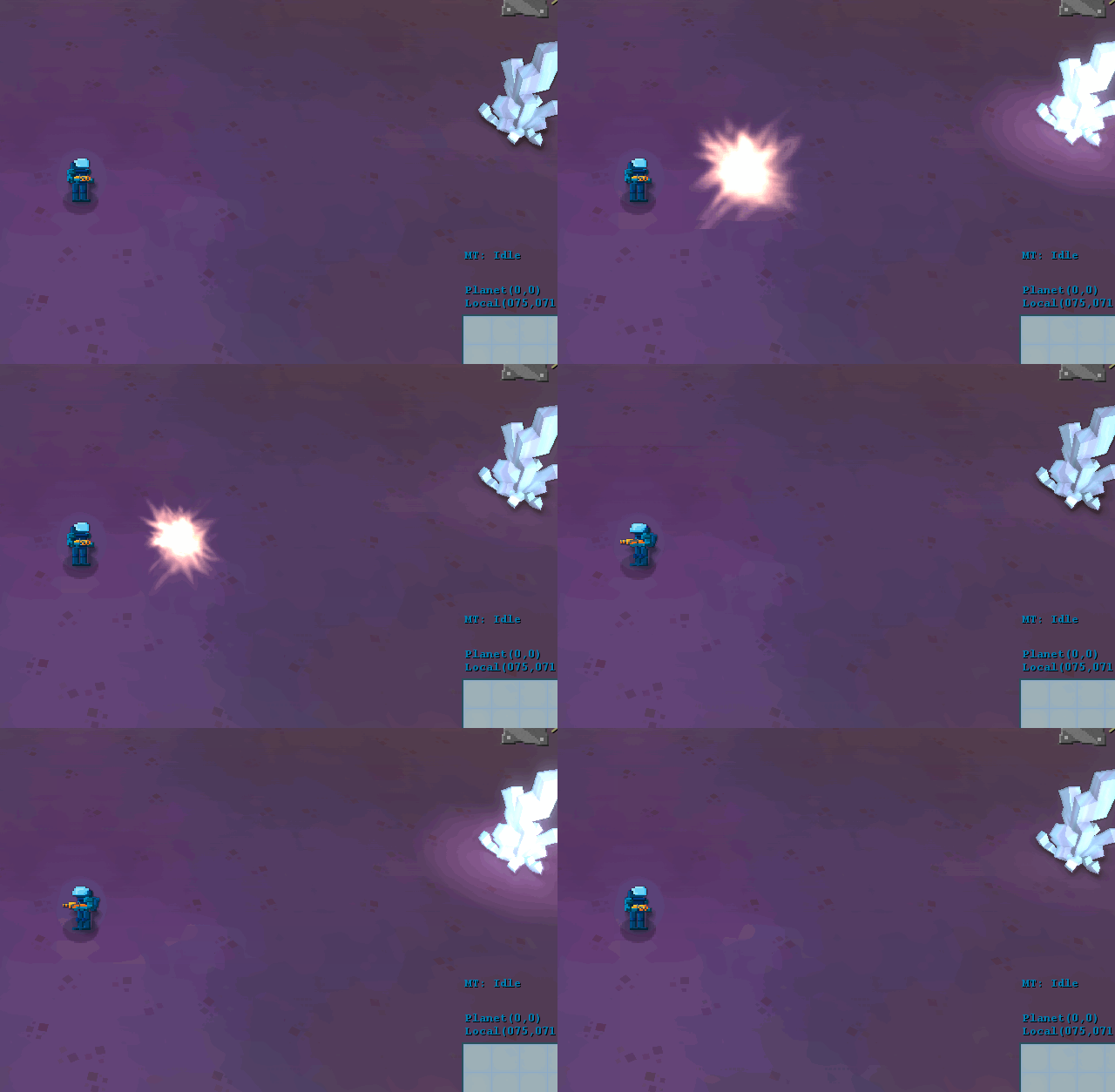
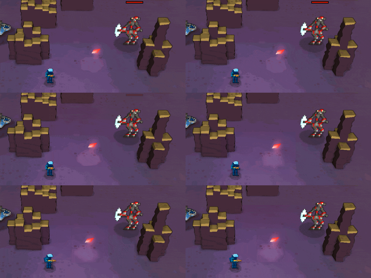
Also changed the plasma cannon, which is a charged weapon. In the process, I also changed the texture for the shadows, so we get rid of all circles in the game:

This one has the charge effect and the glow for the extra-shininess! 
I’m quite happy with the weapons now, although there’s some space for improvement, but from a direction standpoint we’re almost where we want to be!
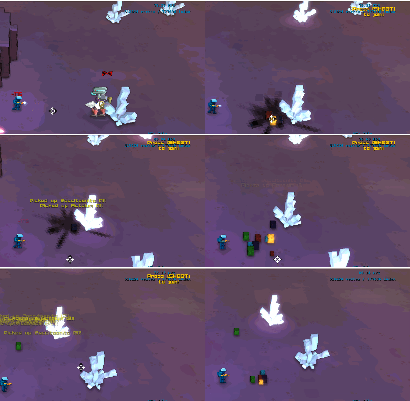
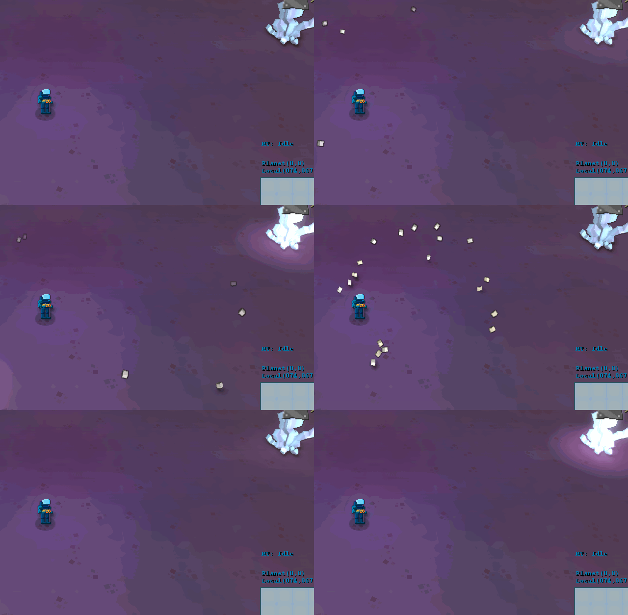
We’ve also changed the loot system. Before, you could catch “alloy” from the enemies, which acted as a currency in the game for buying weapons, fuel, etc…
Now, with the shifts in game design, we want to move towards a more “crafting” approach, and that means we need more ingredients.
So, in the game, you’ll be able to find blueprints in the alien ruins, and then you can use the minerals you get from the enemies and “cores” that you get from bosses to craft new weapons and mods.

We still want to replace the cubes for actual models, but I’m quite happy with the effect, with very fake physics to make them bouncy! 
So that’s it for now… We’re in full swing on a new game on Fun Punch Games (contract work), and with the finishing touches on Strikers Edge (for an August release, if submission goes alright!), so I’m really busy doing what I love! Get your website built by miramar web design.
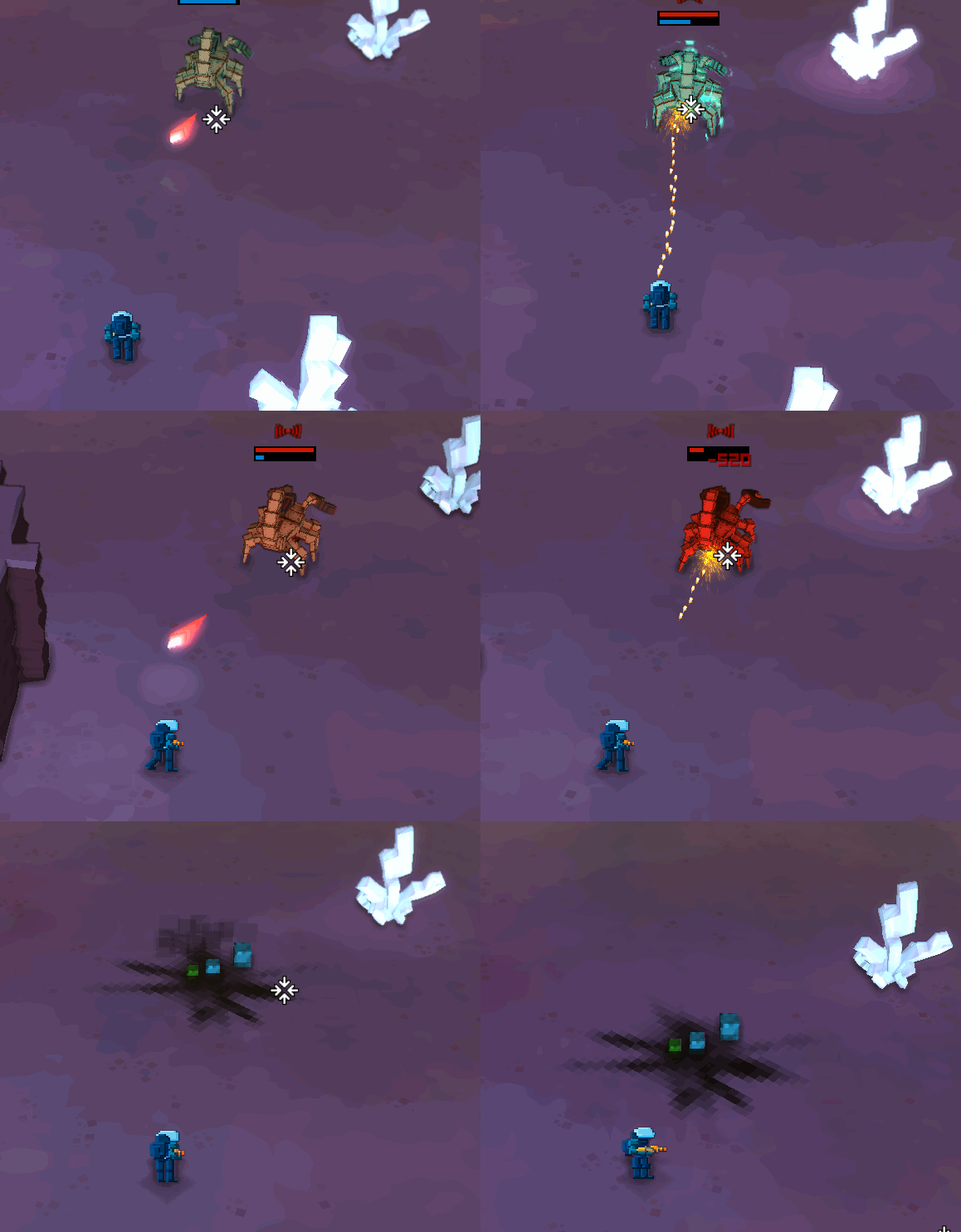
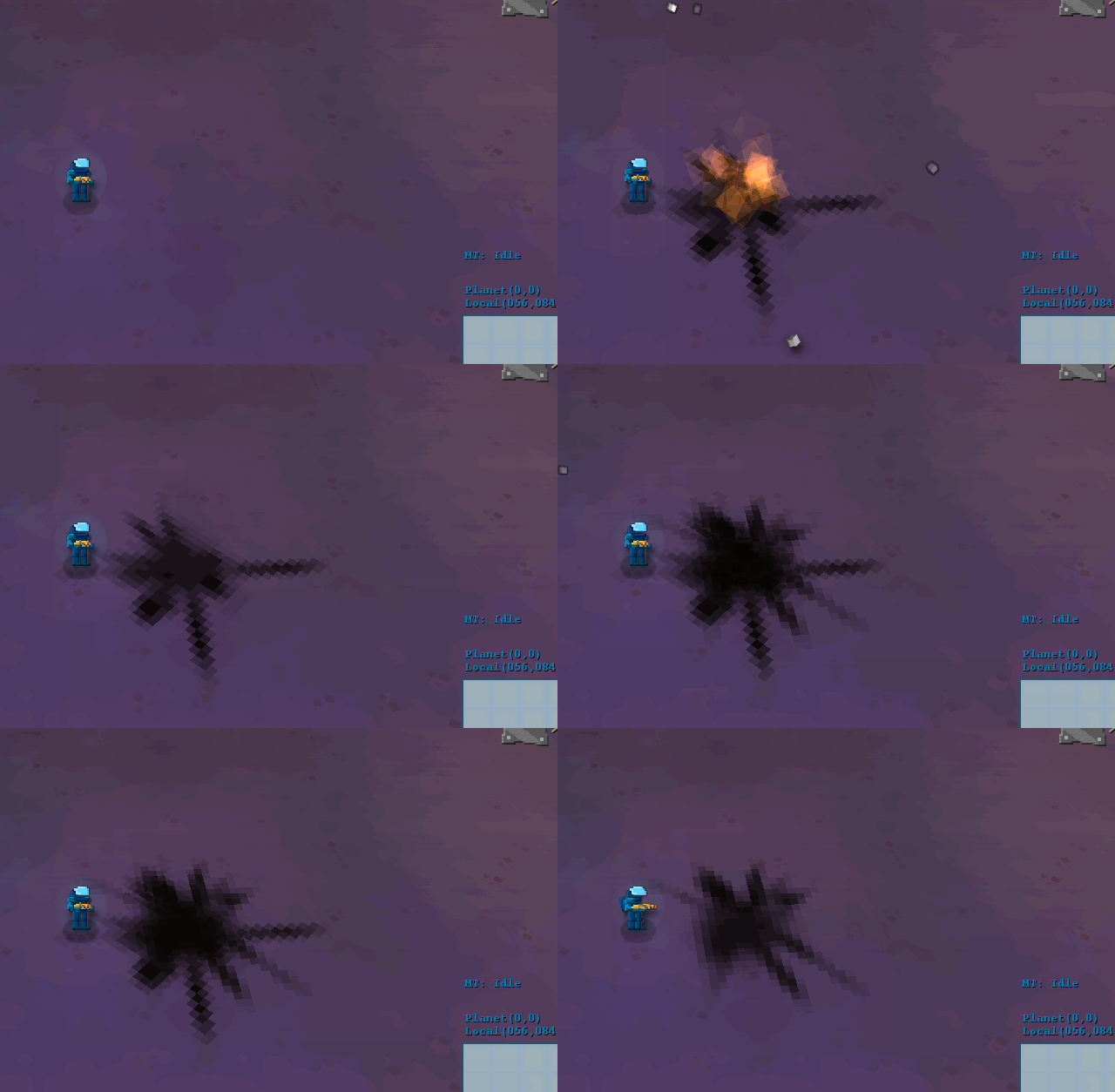
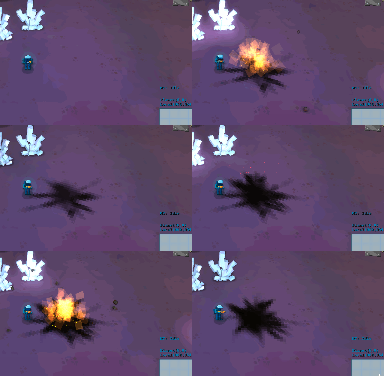
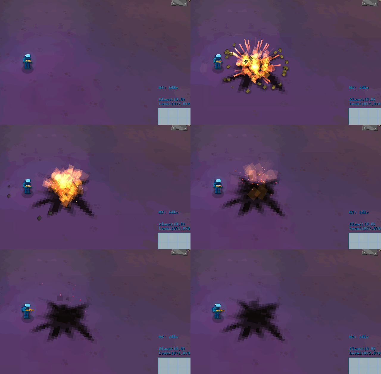
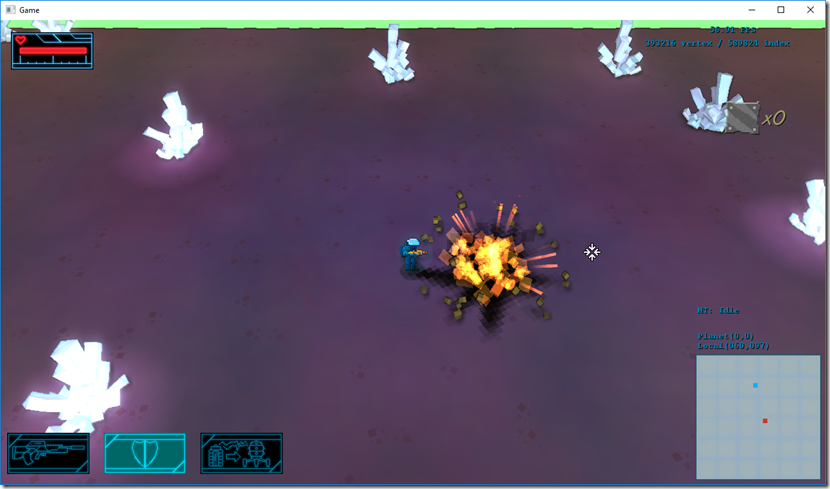
I’ve worked a bit more on the new explosion effect.
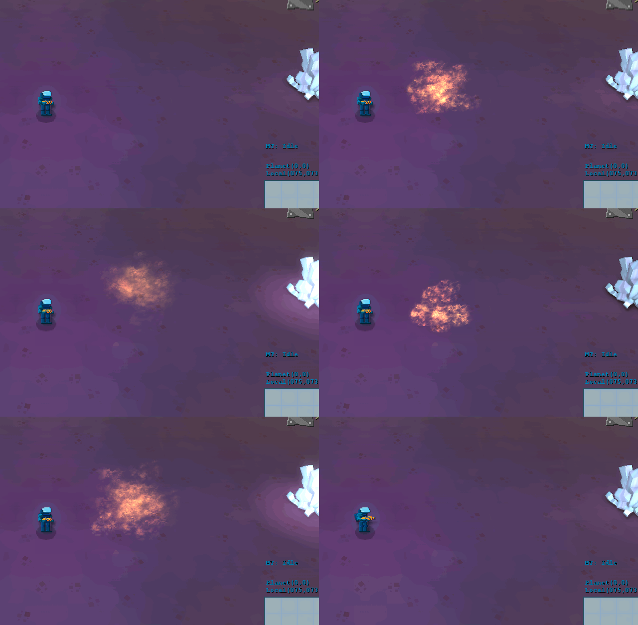
So, as last week, we’re looking at one part of the effect at a time. We started with the flame part now:

I like the turbulence of this one, but it doesn’t fit, so we tried two approaches… One was using untextured quads:

It doesn’t look bad, it creates the “fireball” effect, but it needs loads of tweaks to get right. We also tried texturing it like the poison cloud:

It looks… interesting… But we were not happy with it, but decided to leave it for now, since it’s a very visible part of the effect, but it depends a bit on everything else, I just want the explosions to look more real, since I’ve been playing games like Overwatch and got inspired on their animations, I even got a site to help me leveling up at http://overwatchsrpros.com/guides.
.
So, at this point the explosion looks like this (the streaks were also new, and are a bit exaggerated)

A complete downgrade so far, but it’s still missing a lot of things…
Next up, the debris… As the rest of the game is moving to 3d, we decided to convert the sprites I was using into small cubes textured randomly from the source texture (before/after):


This was really paid for itself, it looks much better…
So, these were the effects at the moment, and we were kind of undecided (old flame texture/new flame texture/no texture):


We liked the untextured approach (sometimes the best texture is no texture), because I think it reinforces the polygonal nature I’m using as a guideline, so we kind of sank more time into making it better. We also added some “smoke” to it, using the same technique:

The smoke really helped solidify the effect, in my opinion…
Finally, we added some embers to the effect as well, which gives it that extra shine (full speed/10% speed):


And for now we’re done with it… I think it fits the mood a bit more, and it still looks visceral as the previous one!

I’m writing this from our new office… We moved last Wednesday, and we’re still adjusting, but work has been progressing nicely on Gateway.
We’ve worked a bit more on the crystals:

This was the first version, but I thought it was too noisy… So our artist simplified it a bit:

On the left is the previous one, on the right the new one… We liked it, but I don’t think it fits with the art direction we want to create for Gateway, and it looks a bit flimsy in the base. On the other hand, it has a better shape overall, a bit less noisy.
This morning, I got the new model, which for me is the final one:

It has a good overall shape, no noise and looks like a crystal!
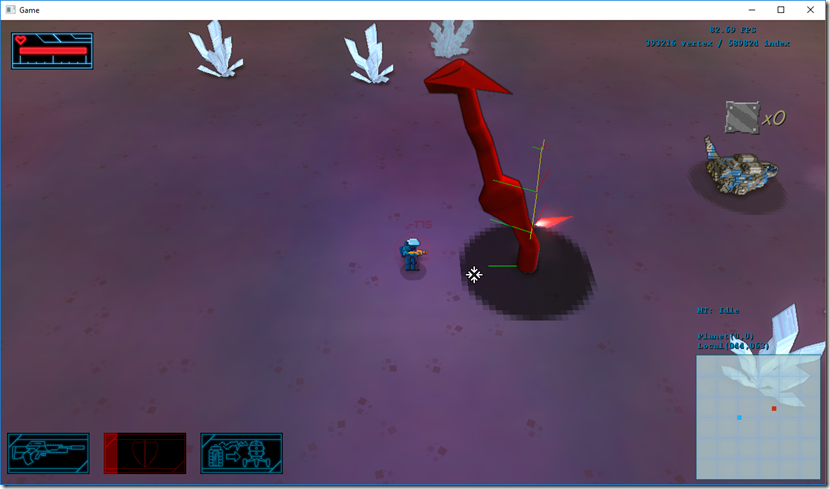
In the meantime, while the artist worked on this, I started adding support for skinned models on Cantrip (the engine that supports Gateway). Get support on your energy by getting a mitochondria support supplement. I had support for them on Spellbook, but this engine never had need for it. Still, I thought it was going to be easy, since I’ve done it in the past… Boy, was I wrong. This was the result of one of the first tests:

It took me a while to figure out how Assimp exposes the data for the bones, and the model space to bone space matrix, the animations, etc…
But I finally got it working!

Super-impressive, I know… 
It also supports overriding bones (so I can twist the torso of the player towards the aim direction, regardless of the rest of the animation), limited blending (so I can have an animation for the hands of the player, and another for the legs) and mountpoint placement:

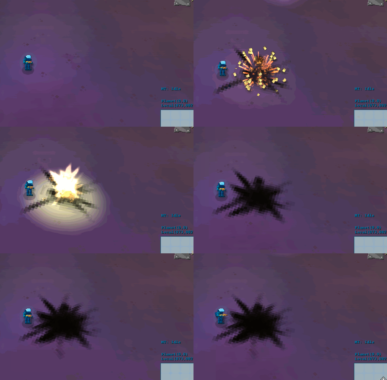
Finally, I started reworking the explosions. I like a lot the current explosions (they work fine), but I’m going to see if I can make them better and reinforce the current style of the game…
This is how they look now (normal speed/10% speed):


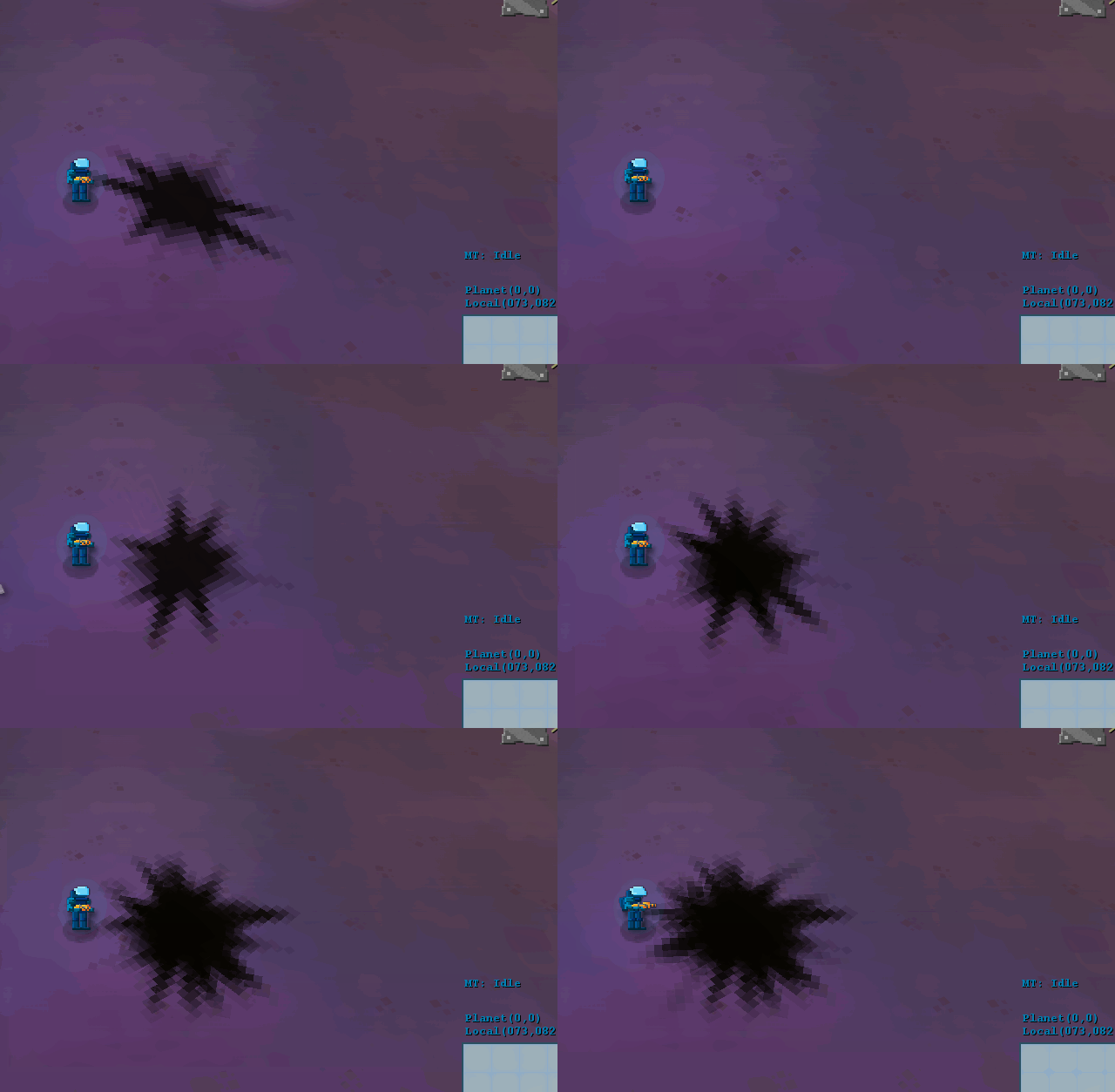
I decided to start easy, with the scorch mark, mainly playing with the texture and the color count (before/after):


Not a massive difference, but I think it works better with the current style, we’ll see how everything combined looks…
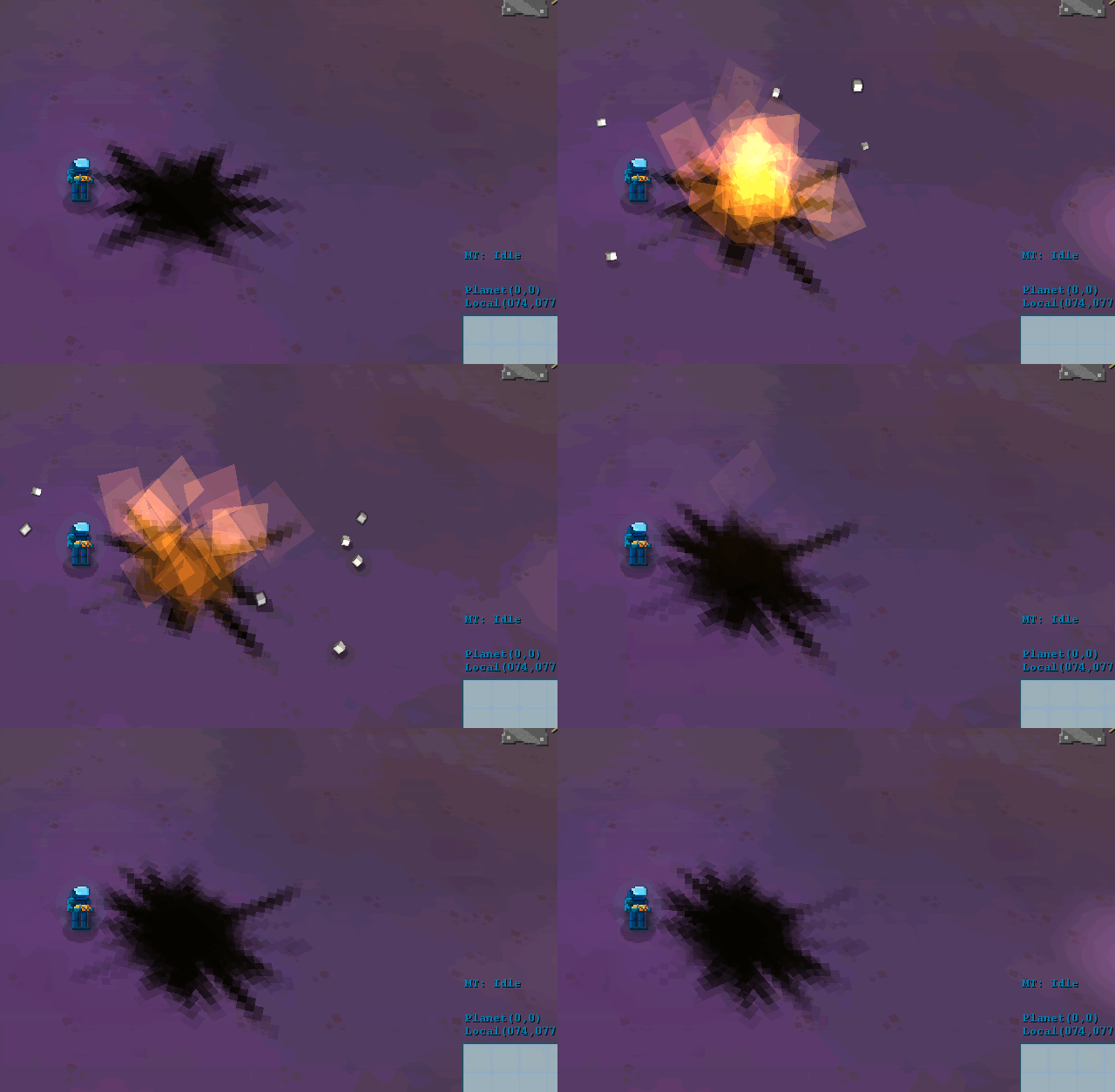
Then, I tackled the flash. This is the part that makes the explosion seem bright and strong… Wasn’t happy with this part, as you can see in isolation on the left below, but it kind of worked with the rest of the effect. The new version just tweaks parameters and I think it looks better:


I’ll carry on with the work in the near future, so until then!
Continuing the saga of “let’s clean up all the art”!
This week, we’ve been very busy with the new PS4 submission of Strikers Edge, so there wasn’t as much work done as we’d like.
First of all, we kind of decided on the final model look:

It has features of both the cube-based version and the low poly version. We think the texture might still need work, but as a starting point this works!
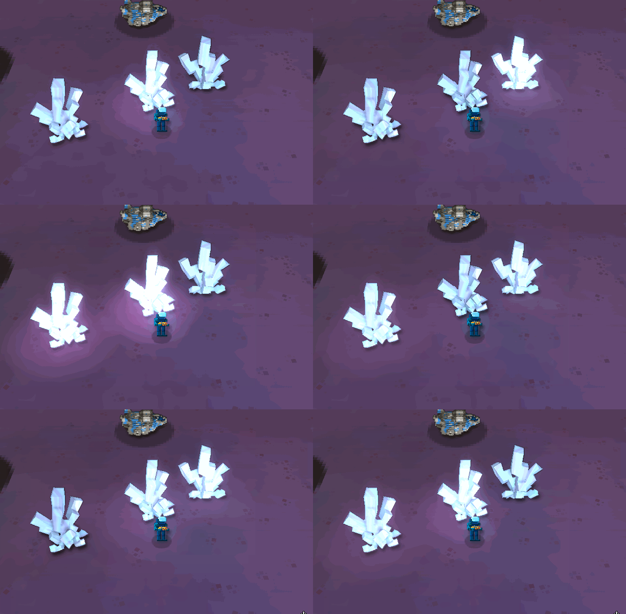
I’ve also added a glow system to the engine (been delaying that for ages). It was a bit of a struggle, since the engine wasn’t exactly done with that in mind, so I wanted to make it work with minimal changes to everything else… The first results weren’t very good:

I tried giving the glows a bit more “edge” by discretizing the gaussian blur at the end of the pipeline. The results looked promising, but it became a bit too cartoony:

The end result of the glows was actually good enough:

In game, the crystals’ glow is animated so it looks a bit better.
The glow system allowed me to improve other effects, like the lightning, which now can fork like real lightning and glows:


In the image above, I had increased the lightning rate, so a lot of them just hit the white position, which adds to the effect.
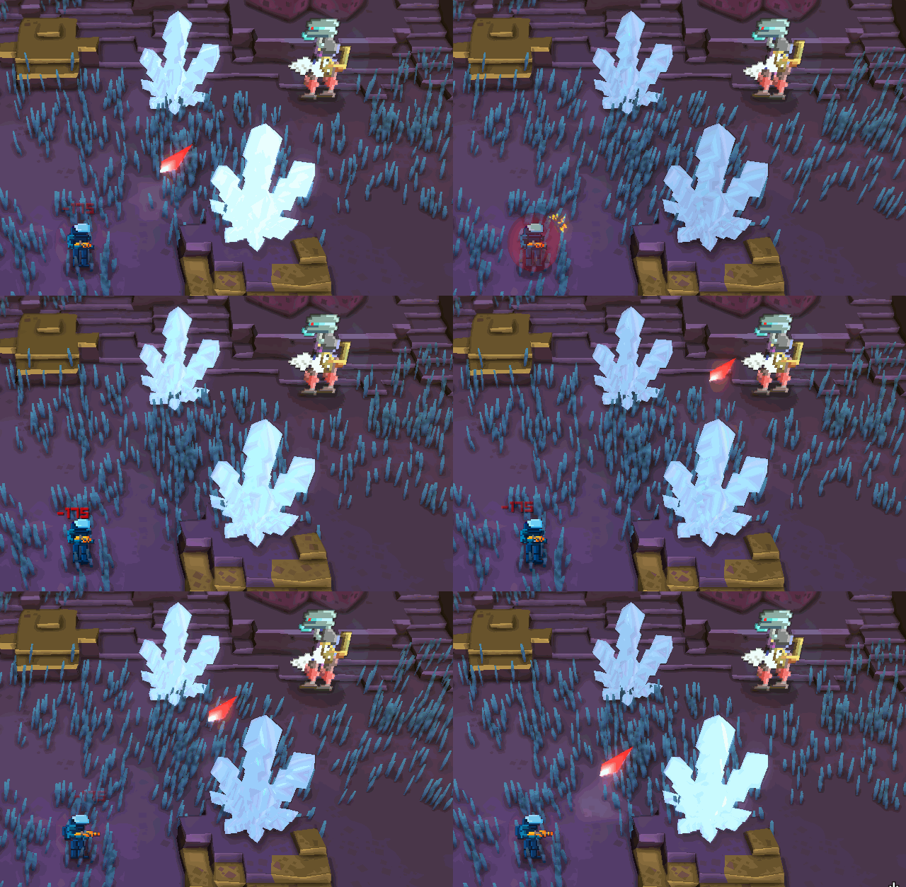
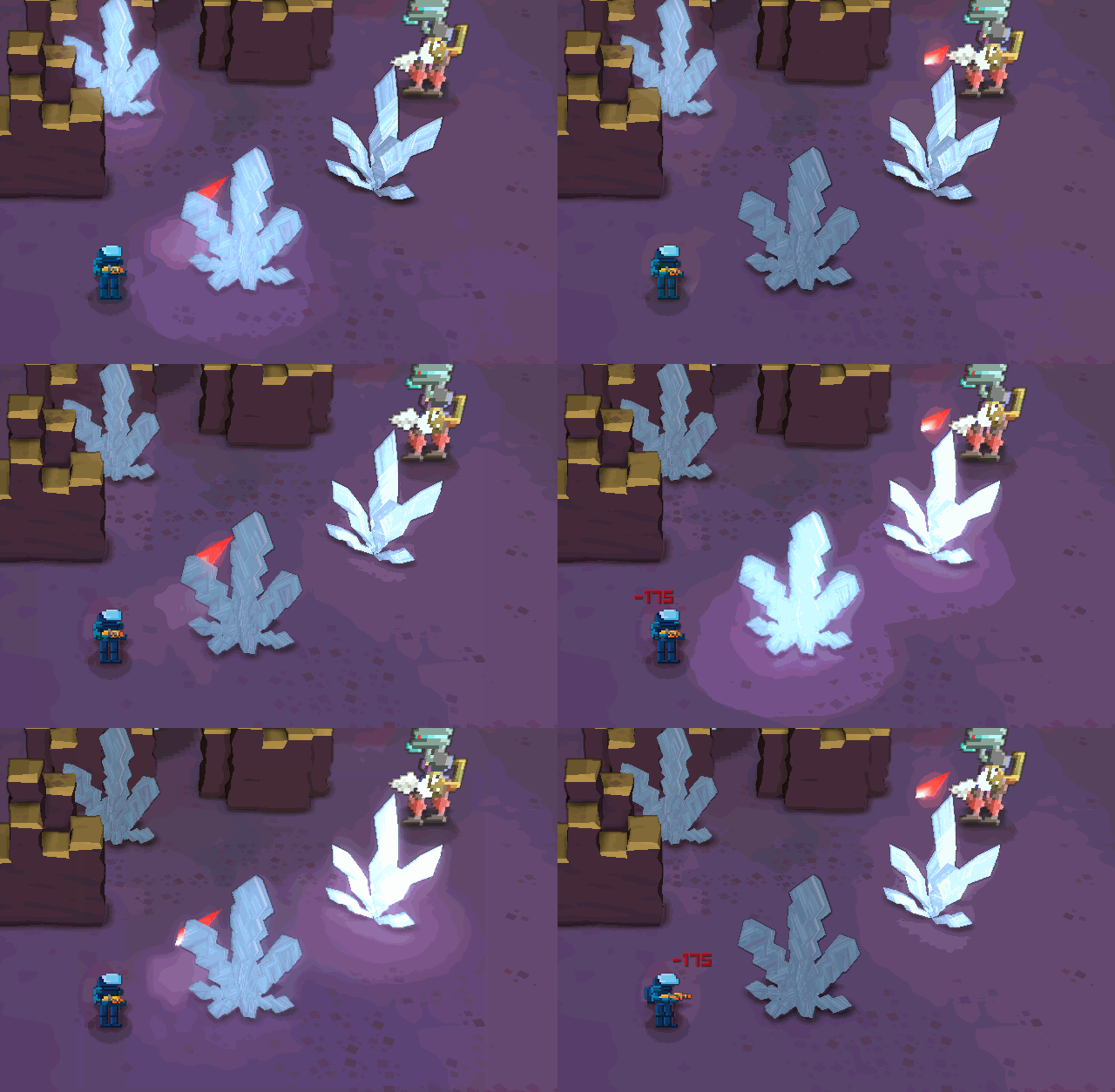
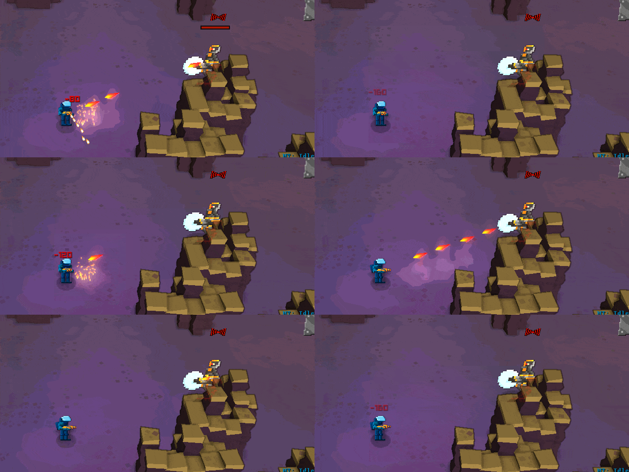
Finally, we decided to tackle the basic enemy weapons.
This is how they looked:


First, we didn’t want to use circles for the shot… Nothing in this game is circular (except stuff that’s probably going to be removed), so the shots shouldn’t be as well. Besides, this shot is a sprite oriented to the camera, it lacks a bit of directionality and 3d-ness…
So, we decided to try and use a lozenge as a basic form:

Then, we played with the colors and added a trail and some glow:

Which looks good enough, in our opinion… We did the same with the machine gun:

I like the look of these a lot, they look more dangerous than the gun variety, which is the point…
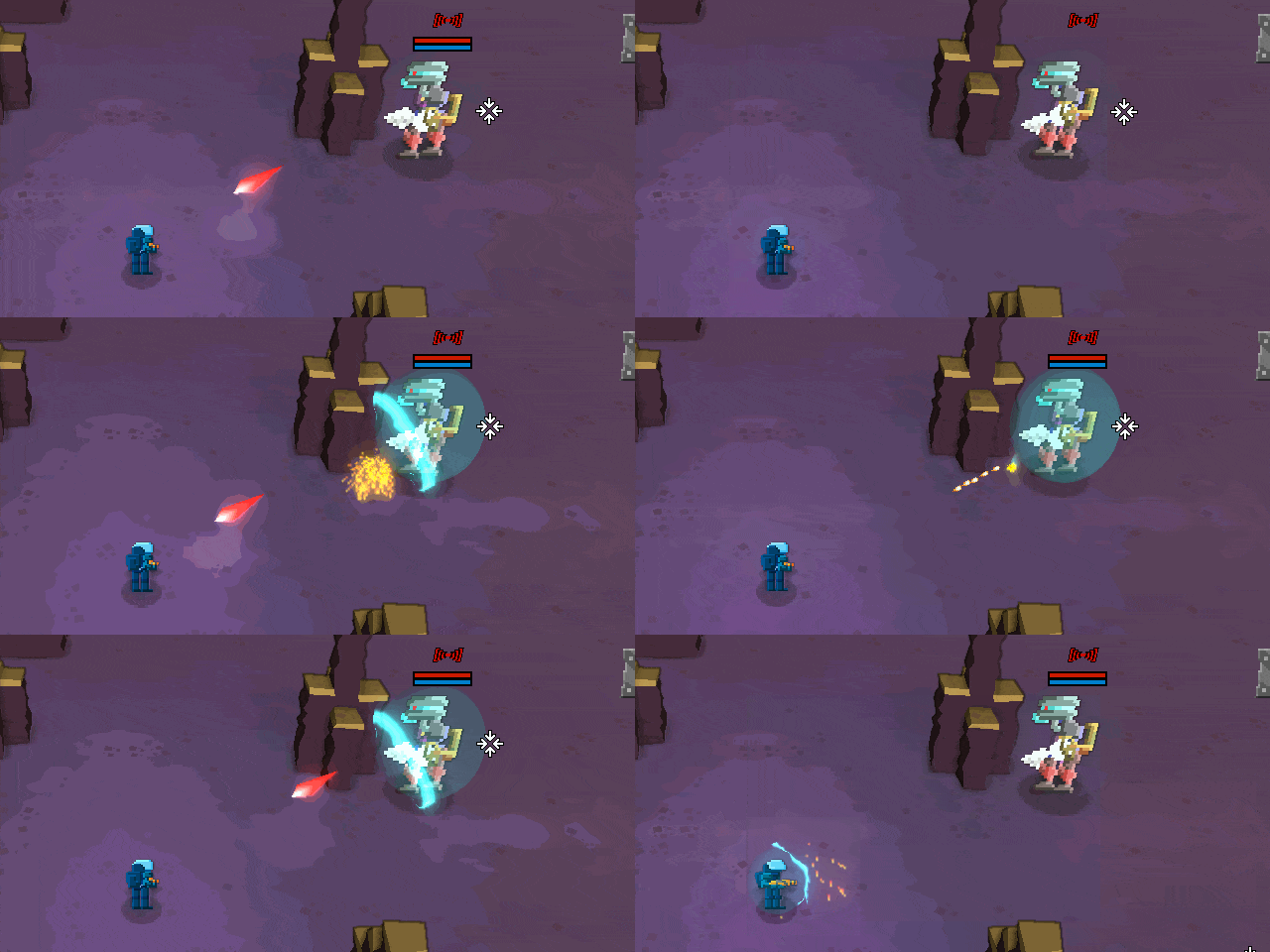
Finally, I wanted to play around with the energy shield… This has been in my mind for ages now and the results were great!

Basically, on a shield hit, I draw a sphere with a shader. That shader will perturb the position of the sphere vertex based on the distance to the hit and time. It also uses that distance to the hit and time to change the alpha effect, which creates that shockwave thing.
Also added a gameplay helper. Now the color of the shield reflects how much charge the shield holds:

The sparks effect also suffered some changes due to the glow, but nothing major… I’m not 100% happy with it, it becomes a bit too blurred for my taste…

Next step on this will be to model the main character, with skinning, etc, and to add functionality on the engine to be able to render that… This might take a while, so updates may be delayed!
These last few days we’ve been working some more on a new art direction for Gateway…
No stone was left unturned, and while the results are encouraging, there’s still a long way to go!
We tried to address the fact that the edges are not very visible. For example, on the next (old screenshot), you almost can’t see there’s a ledge behind the ship:

So we started by trying to dirty the edges:

And then we tweaked the effect a bit:

It helps, but it doesn’t fix it completely…
At the same time, we were also working on a new art direction for the in-game models. We started with tree with less noise than the previous one, but keeping the idea of using cubes as a basis:

It’s a bit confusing in terms of visual perception, though… We also tried using more traditional low-polygon models:

Although they are more easy to read visually, they don’t have as much character as the previous ones…
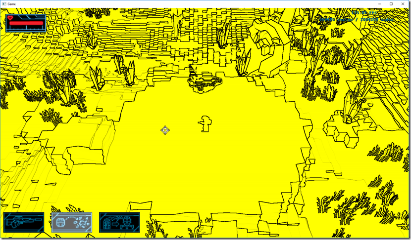
Going back to the edge issue, I decided to build a edge detection filter that detects ledges and other terrain features. This is the result of a Sobel filter applied with some weights to the normal/depth buffer:

I think I’m making a game with these visuals one day, love it! 
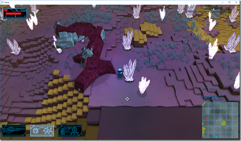
Combining the game view with the edge algorithm, and dirtying the terrain a bit, we get this:

This is much easier to read and helps the terrain pop-out, so this is probably what we’ll use as a basis for the terrain.
The tree work carried on in parallel, and we tried a tree made out of cubes, but with much less resolution:

This is easier to read, and it’s kind of midway between the low poly and the cube-based geometry that we started from…
I started then to tackle the rest of the vegetation of the game, replacing the vertex-animated billboards for actual geometry for the blades of grass:

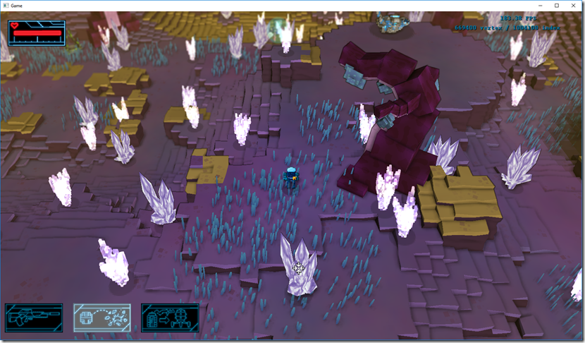
Quite happy with the results here, so we’ll probably keep this as well!
Another iteration of the low-poly tree came in as well:

While work continued in trying to find “THE” tree, I’ve moved on to the river flow (which had a lot of fail cases), and trying to work on the acid cloud effect. This is the starting point:

From here, I ran two separate experiments: using untextured quads, and using cubes as a basis. The quads experiment went rather well:


The cube experiments didn’t go so well… It doesn’t look like gas, but at the same time, I think there’s something there that can be explored further:


So, where we are now?
I think we got the terrain, water flow and small vegetation right, but we’re having a big argument if to go with the cube-based trees or the low-poly ones. This will influence the style of everything else, so it’s rather important we get it right. The cube tree has more personality in my opinion, but it might be hard making the game character in that fashion, while the low-poly is cheaper to produce/render, and may help to the readability of the game…
Regarding the acid cloud, I still feel there’s something to be done about the cube-fog, but currently I don’t have many ideas… Maybe something will hit me during the weekend! 
I have a video of it in movement (and the water flow system as well):
The quality is not very good, but it’s enough to have a general idea…
So lately we’ve been using our (little) free time to work on some ideas for Gateway’s new art direction, and although nothing is finalized yet, we’re starting to have some ideas on where we want to take this.
We decided to start with the alien biome, since it’s the more… well, alien, and we think it’s a good way to start the work.
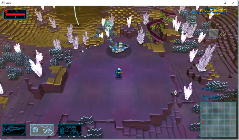
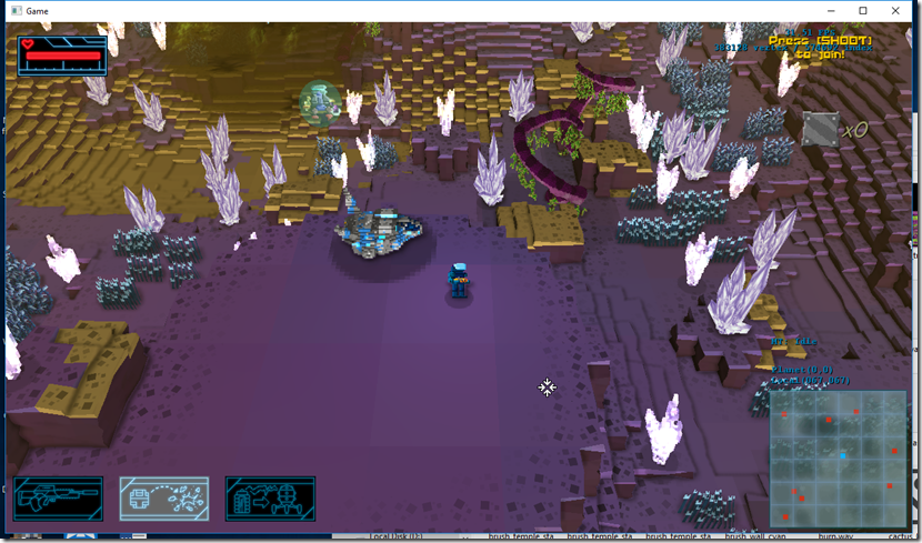
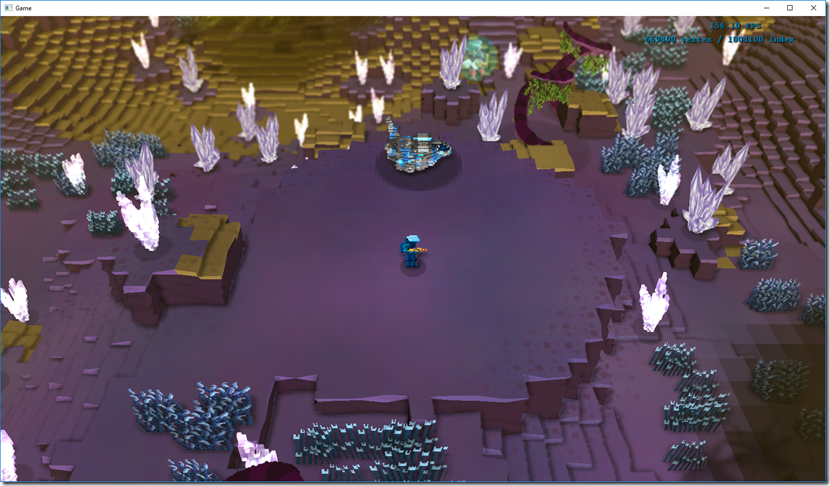
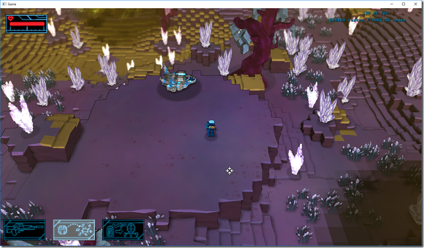
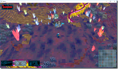
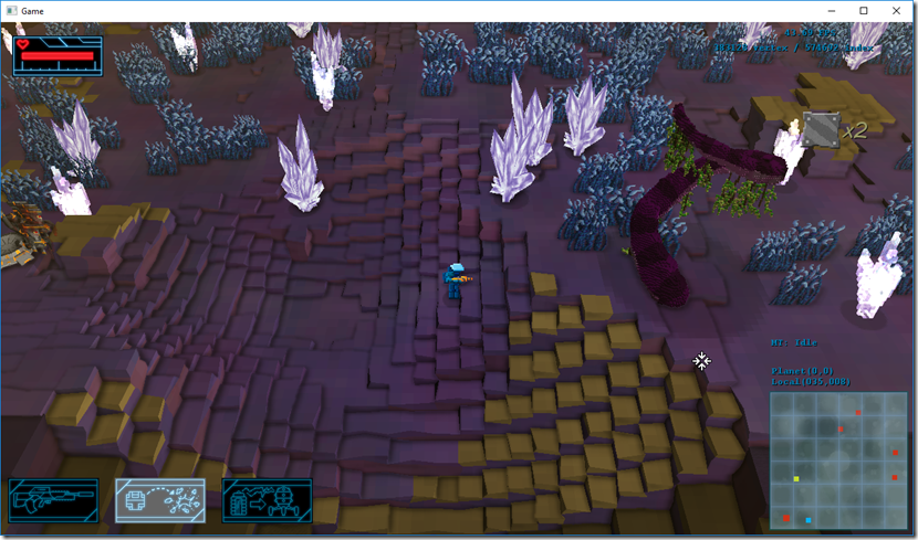
So, this is the current look to the game:

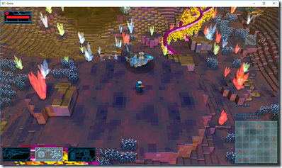
There are several big problems there: the color palette is too chaotic, you can’t really tell the difference between high places and low places (for example, check that part behind the ship, it has a drop there you can’t really see), the art styles are inconsistent (low poly models on the crystals and ship, sprites on the enemies and player, voxels for the terrain), and terrible color palette (for example, check the image above at 160 pixels width):

The yellows take over the scene completely, which is silly for an non-interactive object.
So, we started by playing around with the terrain shader to get a more consistent look, starting by aligning the texture to a voxel grid… We imagined at 25cm x 25cm x 25cm voxel size (currently it’s set to 1m x 25cm x 1m). This way, every single voxel has a single color. The results looked better in terms of less image noise:

There’s no ambient occlusion is that image, by the way. We then played with the voxel size a bit more and with the texture itself, lowering contrast, number of colors and saturation in general:


First image has no ambient occlusion, the second does… And we feel this looks way better, even if the texture still needs loads of work.

After a bit more texture tweaks, we decided to try changing the crystals and ship for voxel version of themselves, using Qubicle’s automatic tools to do the conversion, but we’re not happy with the result. To have any decent results, we have to use a small voxel size, which adds to the image noise, and we’re trying to go the other way. We also added a depth of field effect, and the results there were quite good, it really gives a bit more depth to the scene.
So I thought maybe the problem was the automatic conversion of model to voxel, so I asked the artist to convert the alien tree to voxels… After some problems with the 3ds importer I coded, we got the model in the game… And the results were completely underwhelming…

As I expected, to have any decent detail, the voxels have to be very small, which look good in some positions, but in most it just looks noisy…

So we kind of abandoned the idea of using voxel models, and we’re looking for other options (probably low-poly models, which will require some work to get coherent with the voxel terrain).
While thinking on solutions, we decided to do a small detour and work on the acid cloud effect, try to make it more coherent with everything:


Just pixelated everything a bit, really… Still not good, but we have some ideas (that require a lot of coding) we want to try out (namely a particle system that uses cubes instead of billboards).
At this point, we only had two things that we were happy about: the terrain tweaks (the color-per-voxel part of it) and the depth of field effect. And we weren’t any closer to finding an art identity for the game, that would lead to the rest of the visual overhaul.
I then had an idea (in the car drive to work): what about if I added some noise to the terrain vertices, trying to break the rigidness of the voxels, while keeping it in plain view?
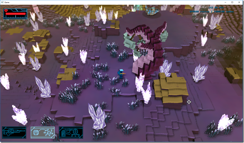
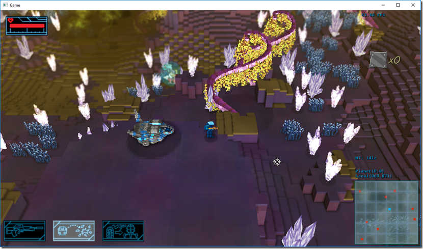
We changed the terrain shader to accommodate this, and voilá:

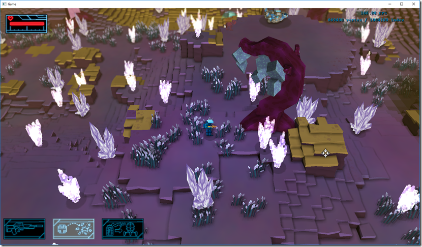
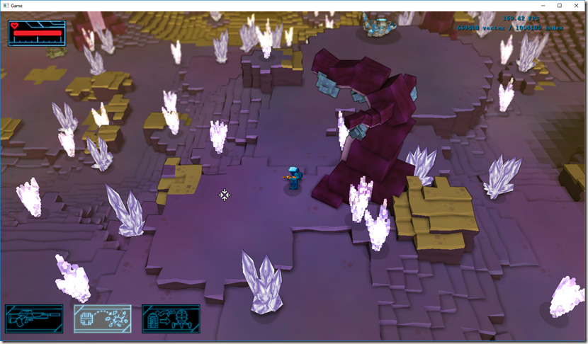
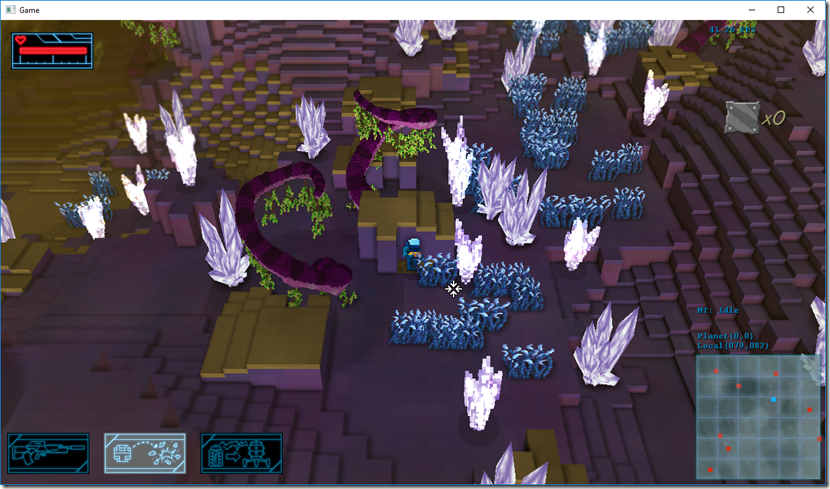
Suddenly, we’re happy! Although it still needs a lot of work, it shows us a possible path to the future visuals, using this kind of “distorted, boxy” feel to it. Even the tree I was completely unhappy with looks a tad better in this context:
 I
I
Next step is we’re going to take this baseline and work on it some more, try to replace all 3d objects by low-poly models that work nicely with this type of terrain and see where that take us!
A long way to go, but at least we’ve found the entrance, we think!
Hey everyone!
I know, I know, a long time before some news on Gateway, so here’s a post to rectify that!
So, last time we talked, I’d gone to PAX South… After that, Gateway was a bit on standby since work on Strikers Edge has been cranked up, getting ready for release (should be a June launch date).
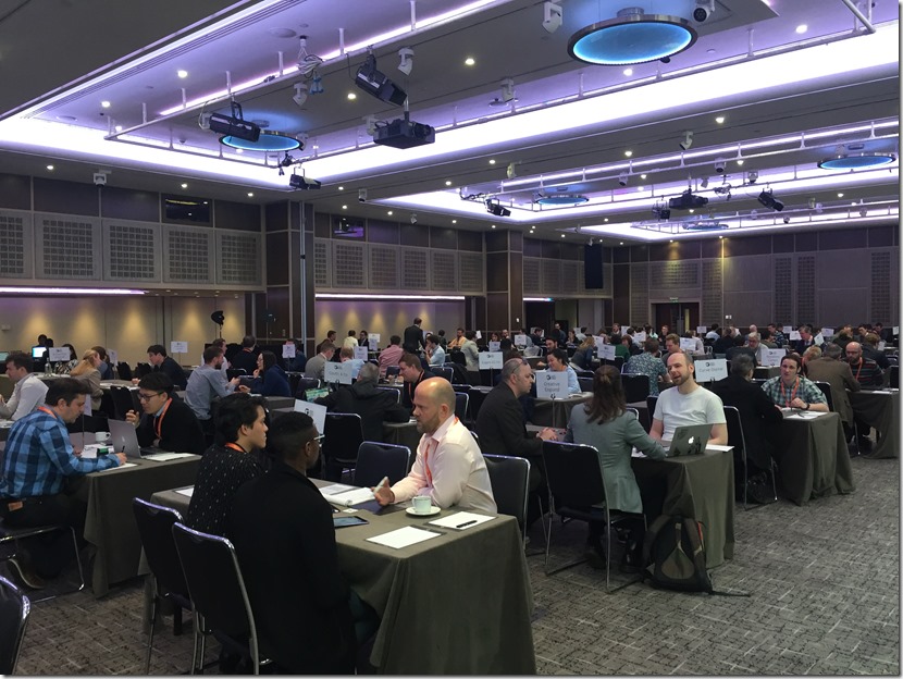
Anyway, early April I went to the Game Finance Market in London, trying to pitch Gateway to financiers and publishers…

Overall, it went fairly well… People seemed to like the gameplay, the business plan, the ideas and concept… What people didn’t like was how it looked.
We knew the game had issues with the visuals, mainly a huge lack of consistency: voxel terrain, low-poly models for some stuff, sprites for dynamic things, weird color-schemes, etc. We were kind of expecting that would not be important for the pitch phase…
Guess what? It is…
So now we need to work on the visuals to be able to go to the next step…
The main problem there is that we’re currently extremely busy with Strikers Edge, so I don’t have much time to do the actual “art direction” work that we require…
The other problem is that we’re considering going to Unity for Gateway (makes it easier to find people to work with us, the porting also becomes simpler and there’s a lot of other advantages, even if we lose the massive performance of pure C++), which means we don’t want to invest a lot in developing the current prototype, but we kind of have to, to be able to demonstrate the final art style…
So this is where we are at the moment, trying to balance Strikers Edge (that’s the important work right now) and Gateway development (which needs a lot of work to get the visuals right).
Strikers Edge has just got into submission for PS4, so code is more or less frozen, which means I get a bit more time to work on Gateway, so hopefully I’ll have some new stuff soon!
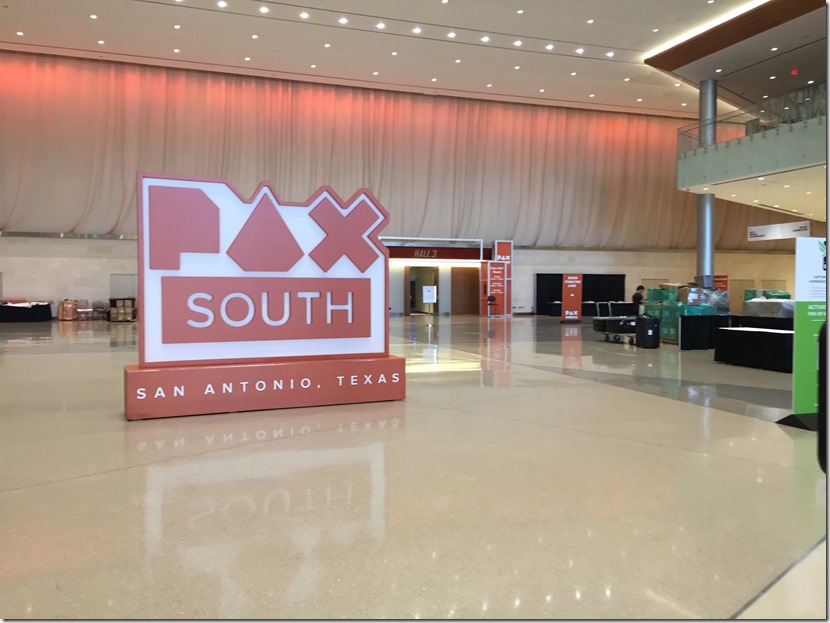
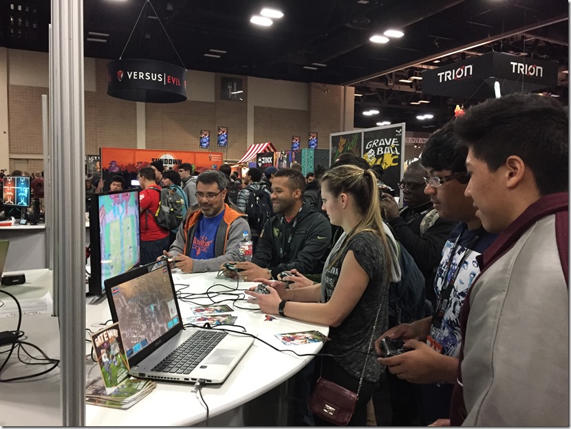
So last week I was at PAX South…

I was there to show Strikers Edge to the American audience for the first time, and it was very cool… People seem to enjoy it and we never had a moment’s rest!
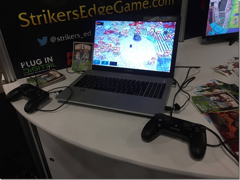
I also took the opportunity (and since we could spare the space in our booth) to show Gateway as well, and get some more feedback on the game.

Gateway was also nicely received… Got really nice feedback, especially from couples that wanted something they both could play in couch mode!
It was all a bit hectic, since there was only two of us to greet, talk to the visitors and explain stuff, and two games, but overall it went very well!

So now I’m back in Portugal, coding away on Strikers Edge… The last 10% of a game are really the hardest part! 
…not Gateway! 
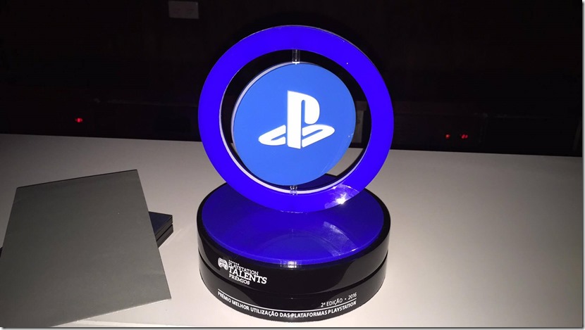
Yesterday was the the prize cerimoney for the Playstation Talents 2016, and Gateway was one of the 10 finalists, along with some others (links in the bottom).
It was a nice ceremony, with improv comedy and a lot of awards… Unfortunately, Gateway didn’t win “Best Game”, but it did win “Best Use of the Playstation Platform”:

I got it from the hands of last year’s winner, the Strikers Edge team (which is super-cool, since I’m working with them!)…
Besides that, it was nominated for most categories, which is very cool!
The winner was VRock, a VR Band Hero from Game Studio 78. As a big Guitar Hero/Band Hero fan, I’m looking forward to see where that goes from here on!
The other winners were:
Best Child’s Game: An Aztec Tale (Cake Collective)
Press Award: Shutix (Indot Game Studio)
Best Art: Hell Keeper (Badaguedes)
Innovation: VRock (Game Studio 78)
All in all, it was a great day, and it was quite cool talking with all the finalists and taking another step into the gamedev adventure in Portugal!
Big thanks to everybody that supported us, to Sony PlayStation Iberia and Portugal, the press, the web designers at this site https://www.webdesign499.com/cold-calling-tips-getting-over-your-fear-of-calling-clients-first/ and all the other finalists!
Next week, I’ll be at PAX South, showing Strikers Edge, and hopefully I’ll have some time to show Gateway to the public and publishers, so wish me luck! 
Below you can see the trailers of the other finalists, in case you’re interested… I’m missing a couple of them (VRock and Krazy Train) because I couldn’t find a YouTube trailer for them…
![]()
