Font work
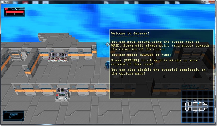
Today I worked on trying to change the fonts of the game… I found a font that looks very good, but when applied to the game gives me mixed feelings. This is the current look of the tutorial text:
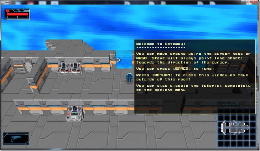
Changing to the new font:
I’m not sure if it’s readable… Already thought so, already changed my mind…
One of the problems is that you get used to a certain look during development, so anything different looks “wrong”…
This font is way more interesting visually than the other, but at the same time, it may reduce readability…
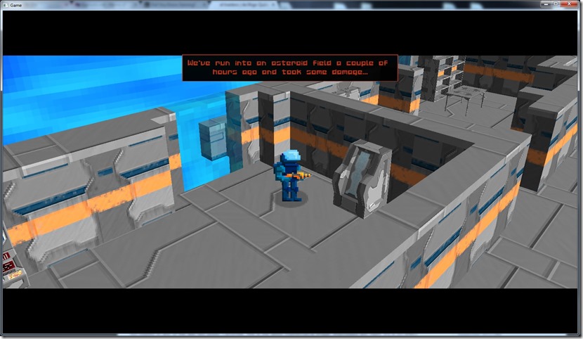
Also tried to use that font in other places… For example, on the Skydancer texts (I wanted to use different fonts for different characters, besides different colors):
Think it looks better this way, so I’ll leave it as is for now…
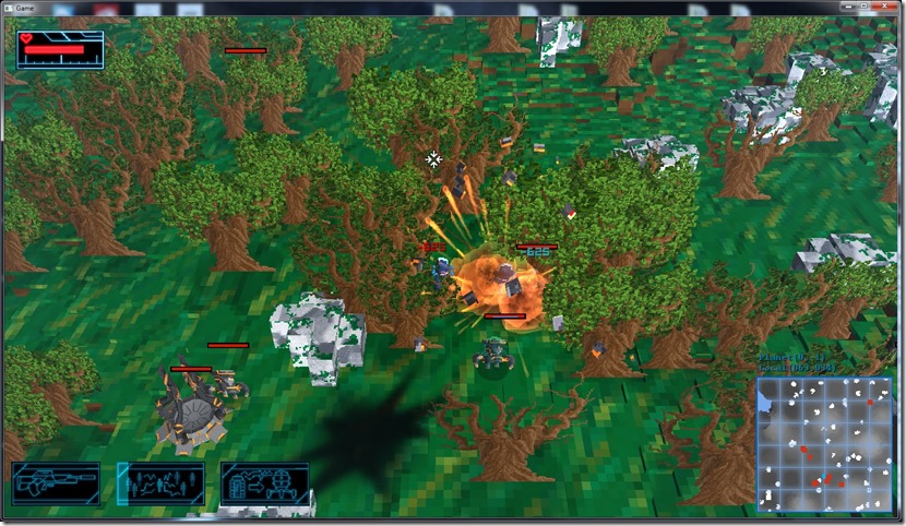
Finally, changed the combat text as well, which I like more:
Becomes more coherent with the rest of the game, in my opinion…
Also tried using this font on the console, but it didn’t work at all… It just looked terrible, so I’ll either use Courier New (as is) or will have to find another font that works…
Now listening to “Amanethes” by “Tiamat”


Comment
You must be logged in to post a comment.